MoMoney
Irreverent, vibrant neo-brutalism meets interactive family entertainment. Punchy comic-style yellow stickers, rotated polaroid-style image frames, and heavy black borders bring an unpretentious pop-art energy to financial literacy.
Visit siteRated
6.9/ 10
From 7 analysed sections. Two measured components and one judged by a model. Distinction is a rank within the library; the rest are scores in their own right.
- AI scorejudged
- 8.7
- Systemmeasured
- 4.3
- Distinctionmeasured
- 8.4
- on the grid
- 0%
- vertical rhythm
- 60%
- type on a scale
- 50%
- contrast passing AA
- 60%
- unlike the library
- 1.14
- model craft
- 7.6/10
- model deviation
- 5.9/10
Colour
Background#fff5dd
Text#111111
Accent#f4f242
Surface#ffffff
Muted#111111
Typefaces
- Display
- Archivo Black
- Body
- Manrope
- Mono
- JetBrains Mono
- Source
- self_hosted
- Scale
- 9 · 10 · 12 · 14 · 16 · 20
Layout
- Grid
- —
- Container
- —
- Spacing base
- 4px
- Radius
- 0px
Capture
- Category
- other
- Sections
- 7
- Captured
- 2026-09-16
- Rhythm
- dark x2 → cream x3 → dark x2
Type rules
- all display titles rendered in Archivo Black uppercase with zero tracking
- eyebrow section markers set in JetBrains Mono with downward triangle markers
- body text set in Manrope with tight line heights and concise line lengths
Colour rules
- warm cream #fff5dd dominates page body backgrounds
- electric yellow #f4f242 is reserved for sticker badges, buttons, and highlighted title backdrops
- heavy #111111 solid outlines wrap all cards, CTA boxes, and rotated photo assets
- cobalt blue #0000f4 acts as the high-impact final CTA background
Voice rules
- lead with punchy, colloquial hooks like 'Y'ALL STREET.' and 'MONEY, DECODED.'
- use numbered mono section headers prefixed with downward triangles
Holds it together
- place primary headline words inside tilted rectangular yellow sticker boxes with heavy black outlines
- offset images and content cards with slight manual rotation angles to create a physical collage feel
- prefix all major section headings with numbered JetBrains Mono taglines like '▼ 01 · WHAT IT IS'
- render primary interactive CTAs as thick-bordered yellow button slabs with trailing arrows
Contrast
text on background17.4:1 AAA
muted text on background17.4:1 AAA
text on surface18.9:1 AAA
accent on background1.1:1 fail
background on accent1.1:1 fail
Type, measured
- Body
- 14px / 1.38
- Measure
- 38 characters
- Display
- 96px / 1
- Tracking
- 0em display
- Scale ratio
- 1.62
Voice
- Tone
- enthusiastic, approachable, punchy
- Sentences
- short
- Person
- first
- Vocabulary
- casual
- Calls to action
- see, plan, read, book, host
Built with
- Builder
- —
- Framework
- next
- Motion
- —
- WebGL
- —
- Nav
- top_bar, 5 items
- Length
- 6.2 screens
Mode
Sections in page order
- 00
hero
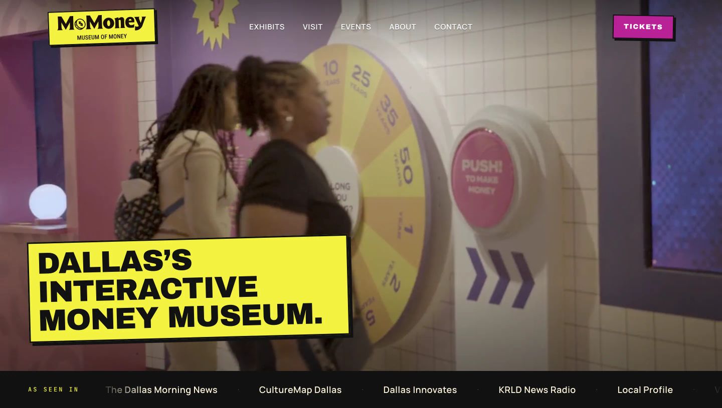
High-energy interactive museum hero pairing experiential video with bold, graphic pop-art sticker typography in vibrant yellow and magenta.
- Mood
- playful + energetic
- Layout
- 1 col · full bleed · balanced
- 01
feature
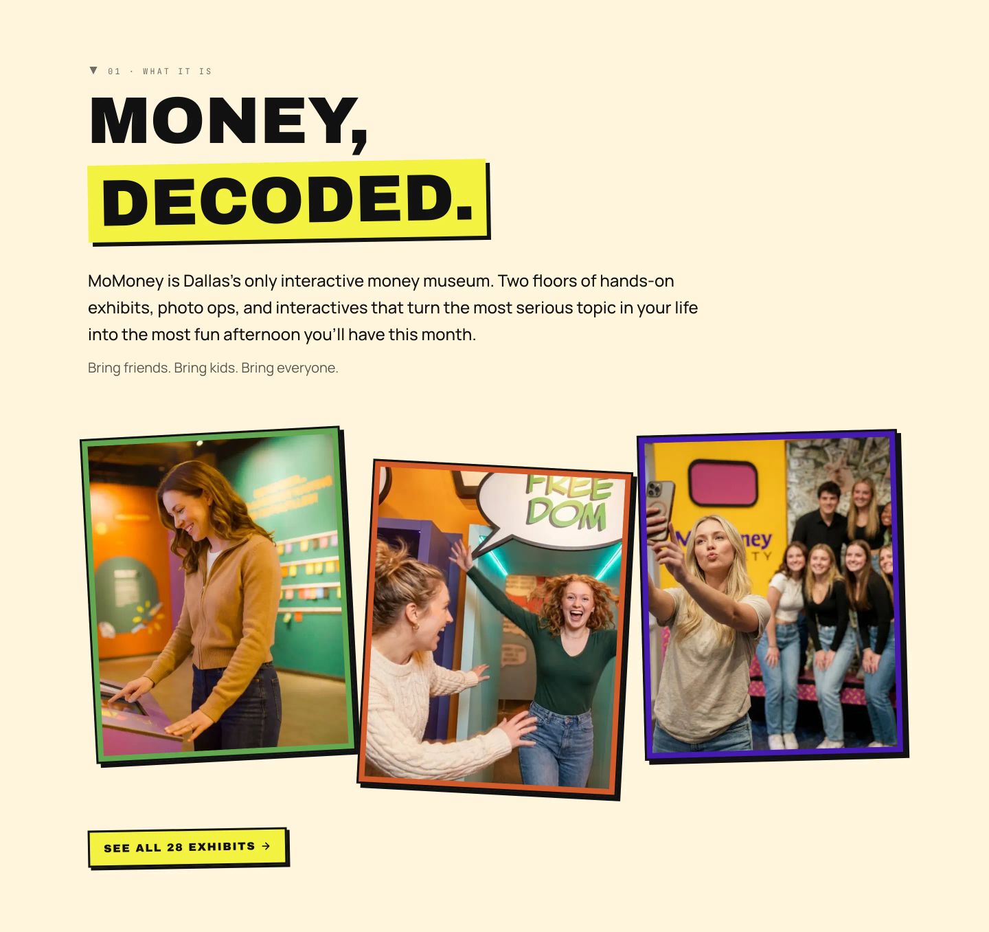
Energetic and punchy pop-editorial feature section with thick-bordered, tilted photo cards and a bright highlighter-yellow accent.
- Mood
- playful + energetic
- Layout
- 3 col · stacked · balanced
- 02
feature
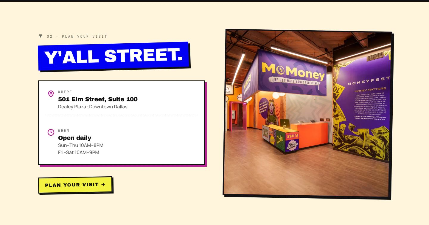
StrongEnergetic neo-brutalist visit section featuring vivid offset-shadow badges, monospace details, and a high-saturation interior venue photo.
- Mood
- playful + energetic
- Layout
- 2 col · split · balanced
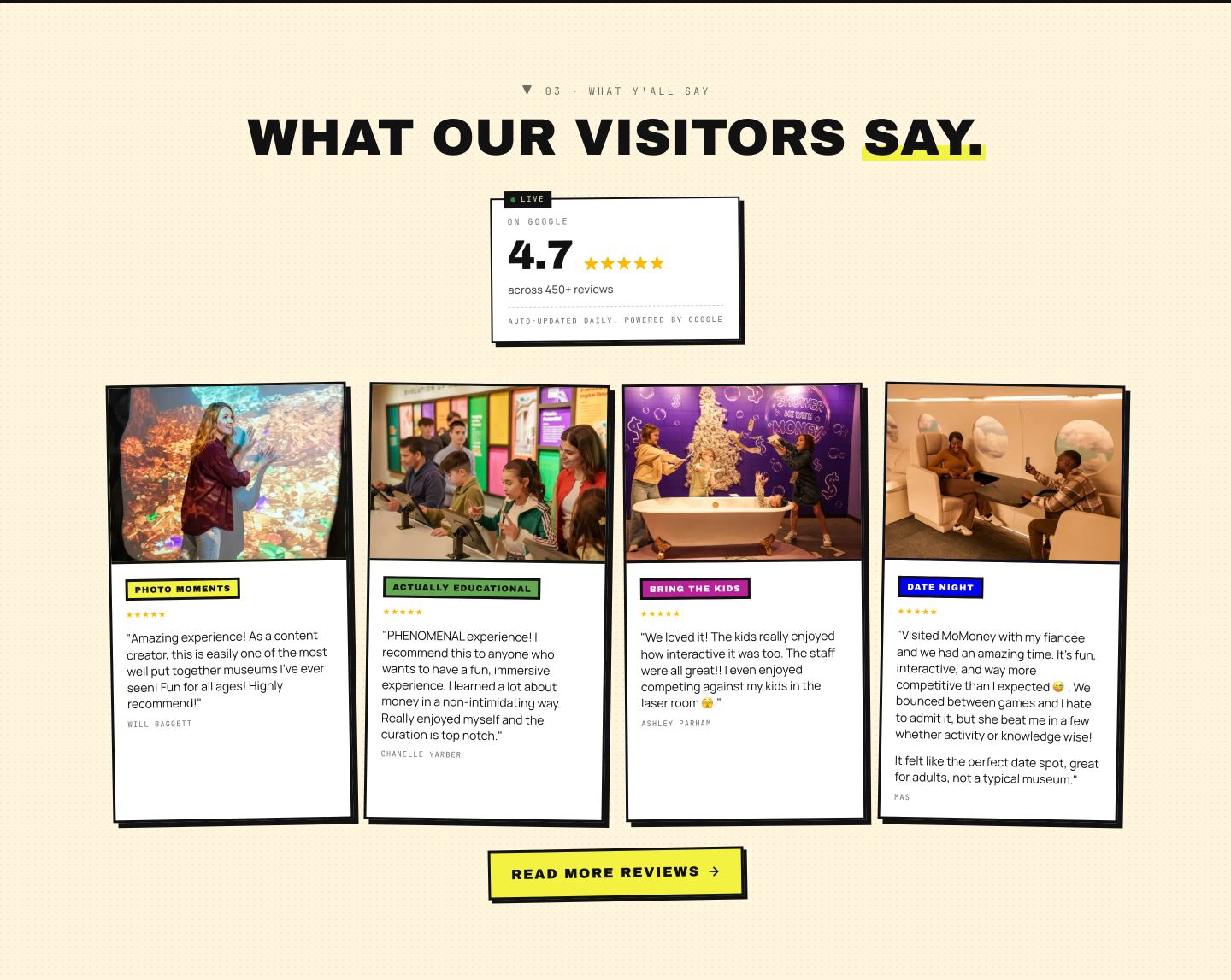
- 03
testimonial
StrongPunchy neo-brutalist visitor review section featuring slightly tilted media cards, high-contrast borders, and playful color-coded tags on warm cream.
- Mood
- playful + joyful
- Layout
- 4 col · stacked · balanced
- 04
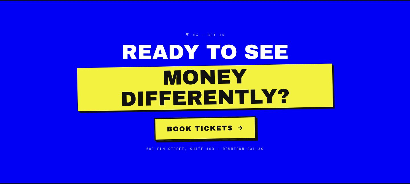
cta
StrongPunchy high-contrast call-to-action radiating electric energy with bold typography slapped over a bright yellow tape-style banner on vibrant blue.
- Mood
- energetic + playful
- Layout
- 1 col · centered · balanced
- 05
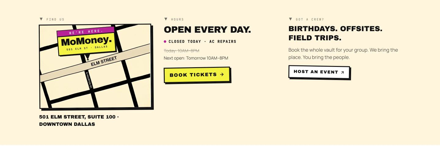
feature grid
Warm neo-brutalist informational grid pairing a bold graphic map with hard-shadowed interactive buttons and punchy uppercase headlines.
- Mood
- playful + nostalgic
- Layout
- 3 col · grid · balanced
- 06
footer
A stark, high-contrast black footer featuring punchy newsletter copy and a bright yellow action button.
- Mood
- energetic
- Layout
- 2 col · split · balanced