Orbi
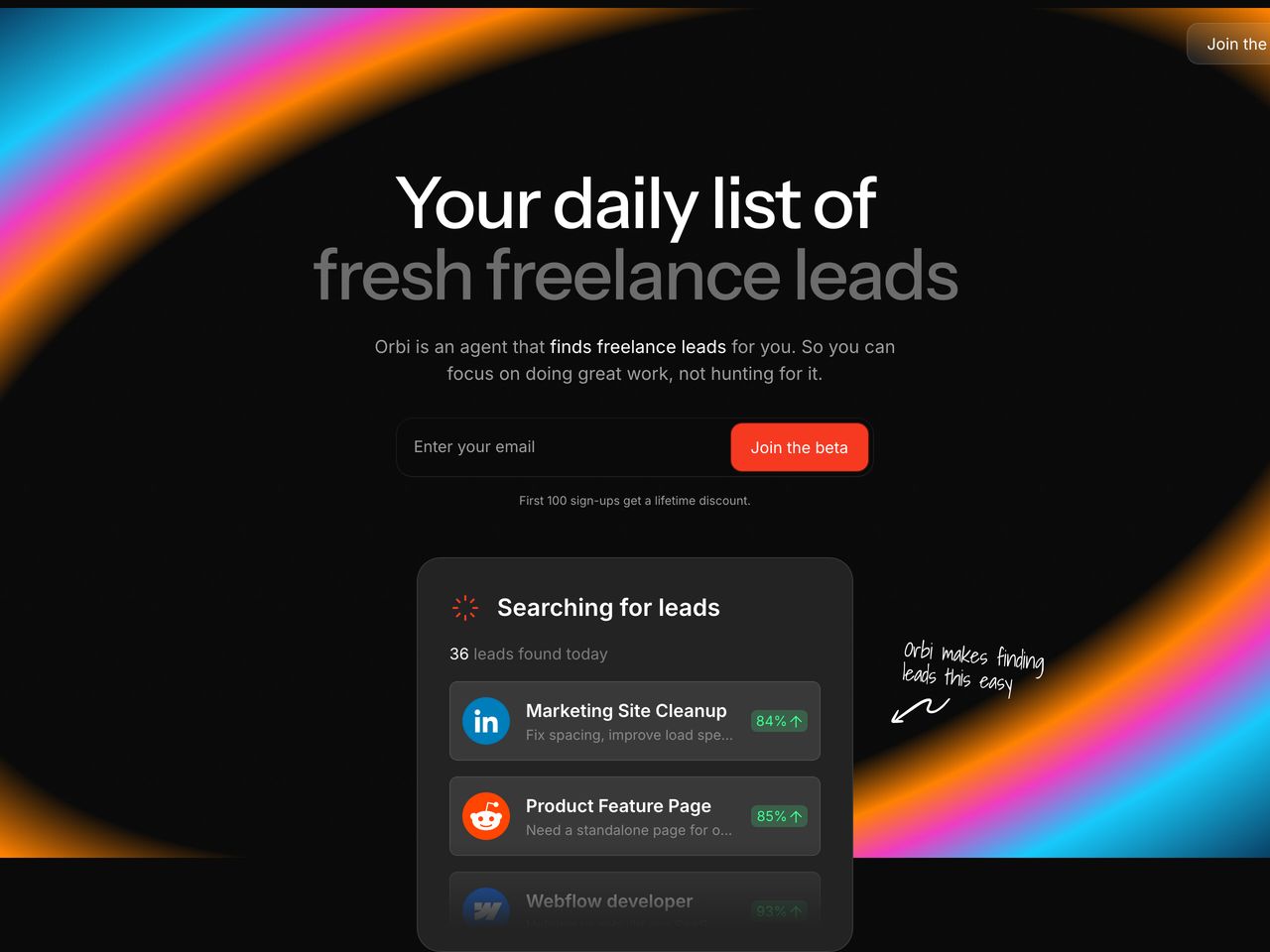
Deep pitch-black canvas illuminated by sweeping, iridescent rainbow light loops. Polished dark UI cards float effortlessly in the center, grounded by stark sans-serif typography, handwritten annotations, and high-impact coral red action buttons.
Visit siteColour
Typefaces
- Display
- Instrument Sans
- Body
- Inter
- Mono
- —
- Source
- Scale
- 12 · 14 · 16 · 18 · 24 · 48
Layout
- Grid
- —
- Container
- —
- Spacing base
- 4px
- Radius
- 8px
Capture
- Category
- ai
- Sections
- 5
- Captured
- 2026-08-29
- Rhythm
- dark x5
Type rules
- display headlines set in sentence case with tight negative tracking (-0.028em)
- body text constrained to a 66-character measure at 18px
- headline sub-phrases styled with muted opacity to create a two-tone text hierarchy
Colour rules
- deep black (#0a0a0a) forms the continuous canvas across all page sections
- vibrant coral red (#f63a22) is reserved exclusively for primary CTA buttons and status pills
- mint green (#43fd91) is strictly applied to match percentage indicators
Voice rules
- speak directly to freelancer workflow frustrations
- keep explanatory paragraphs to two short sentences max
Holds it together
- frame the dark hero with sweeping multicolor gradient light paths
- use pill-shaped input bars paired directly with bright coral CTA buttons
- render UI cards in layered, dark graphite containers with subtle borders
- add informal handwritten annotations with arrows to highlight core product value
Contrast
Type, measured
- Body
- 18px / 1.5
- Measure
- 66 characters
- Display
- 72px / 1
- Tracking
- -0.028em display
- Scale ratio
- 1.41
Voice
- Tone
- direct, empathic, casual
- Sentences
- short
- Person
- second
- Vocabulary
- plain
- Calls to action
- join, enter
Built with
- Builder
- webflow
- Framework
- —
- Motion
- gsap
- WebGL
- —
- Nav
- top_bar, 0 items
- Length
- 3.9 screens
Sections in page order
3 marked strong · 5- 00
hero
Deep dark AI SaaS hero illuminated by sweeping vivid iridescent gradient bands, featuring a centered signup form and floating lead-finder UI card.
- Mood
- dreamy + bold
- Layout
- 13 col · stacked · balanced
- 01
logo bar
A stark, minimalist dark logo strip presenting source integrations under a single concise line of copy.
- Mood
- quiet + clinical
- Layout
- 14 col · stacked · airy

- 02
feature
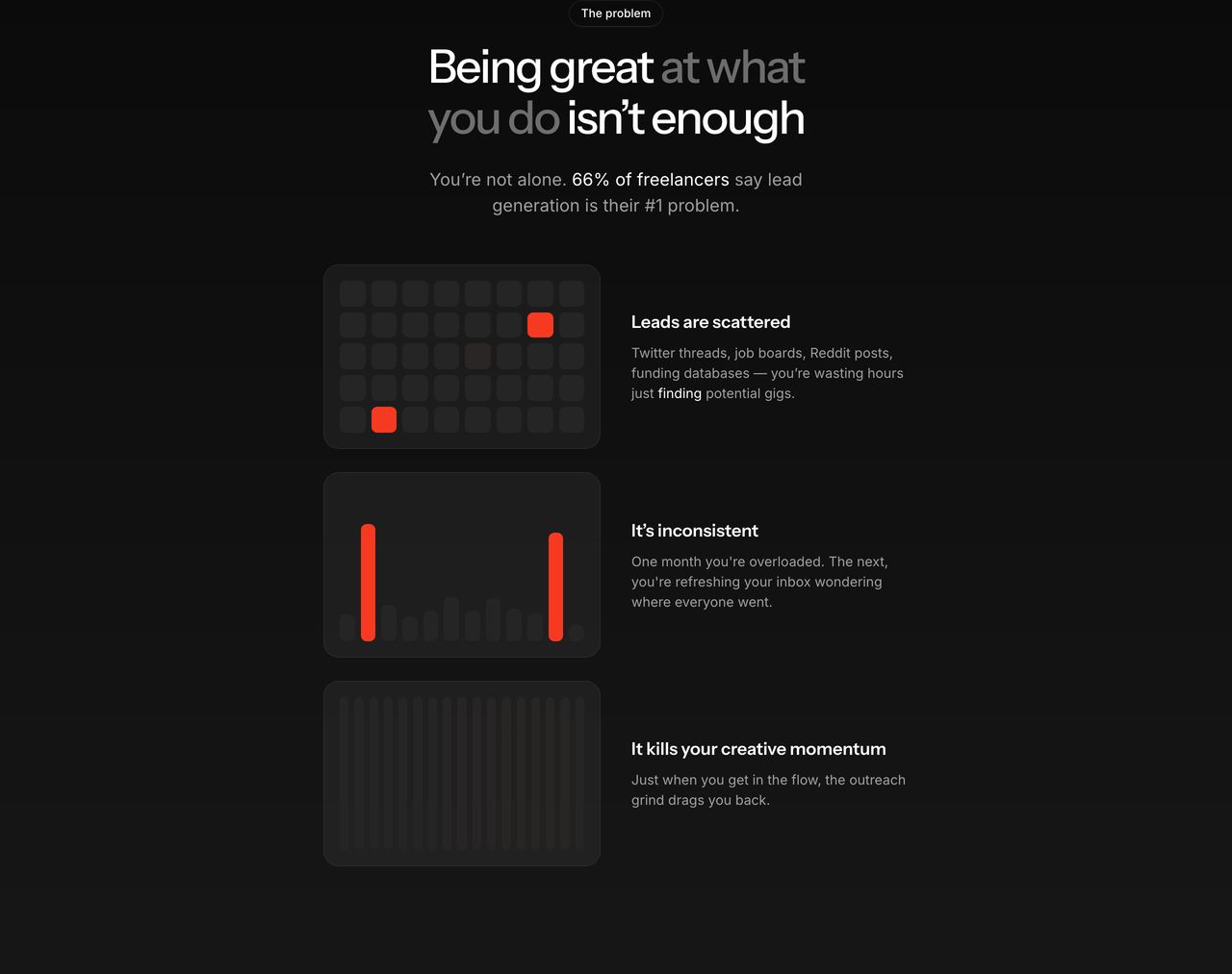
StrongA dark, clinical problem section pairing restrained abstract visual cards with stark typography.
- Mood
- clinical + quiet
- Layout
- 15 col · stacked · balanced
- 03
feature
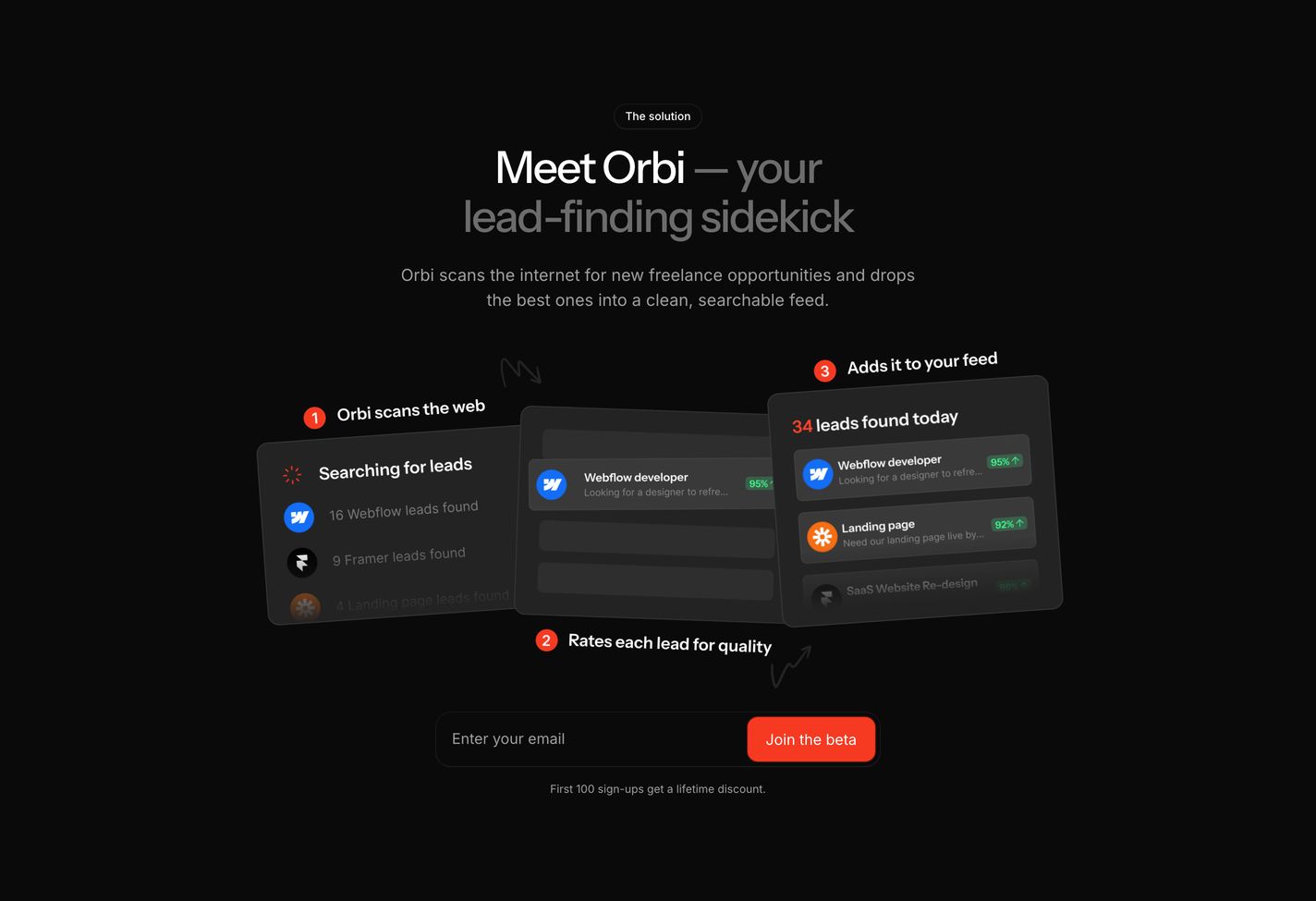
StrongCrisp dark SaaS feature section showcasing a multi-step automated workflow through layered interface cards and a bright red signup prompt.
- Mood
- clinical + bold
- Layout
- 16 col · centered · balanced
- 04
footer
StrongA whisper-quiet, minimal dark footer featuring a tiny whimsical mascot icon above centered, understated sign-off text.
- Mood
- quiet + playful
- Layout
- 10 col · stacked · airy
