dub-co
Engineered, clinical, and ultra-precise. A pristine light canvas governed by faint background grid patterns and hairline borders, framing immaculate UI component mockups. Restrained monochrome typography lets live product details and data readouts take center stage.
Visit siteColour
Background#ffffff
Text#171717
Accent#2563eb
Surface#fafafa
Muted#737373
Typefaces
- Display
- Inter
- Body
- Inter
- Mono
- GeistMono
- Source
- self_hosted
- Scale
- 12 · 14 · 16 · 18 · 20 · 24
Layout
- Grid
- —
- Container
- —
- Spacing base
- 4px
- Radius
- 6px · 8px · 12px
Capture
- Category
- other
- Sections
- 9
- Captured
- 2026-08-30
- Rhythm
- white x3 → off-white x3 → white → off-white → white
Type rules
- display headings set in sentence case with tight 1.15 line height
- body copy measured to approximately 61 characters per line
- monospaced GeistMono reserved strictly for data tables, metrics, and technical labels
Colour rules
- predominantly monochrome light canvas with #fafafa surface panels and #e5e5e5 hairline borders
- functional color accents isolated strictly to status badges, micro-icons, and integration logos
Voice rules
- short declarative headlines focusing on product capability
- active verbs for all primary and inline action links
Holds it together
- frame product mockups and UI cards with crisp 1px #e5e5e5 borders over subtle dot or grid backdrops
- render stats and live application metrics in GeistMono for developer authenticity
- anchor sections with high-contrast pill badges and solid black primary buttons
Contrast
text on background17.9:1 AAA
muted text on background4.7:1 AA
text on surface17.2:1 AAA
accent on background5.2:1 AA
background on accent5.2:1 AA
Type, measured
- Body
- 16px / 1.5
- Measure
- 61 characters
- Display
- 48px / 1.15
- Tracking
- 0em display
- Scale ratio
- 1.32
Voice
- Tone
- precise, declarative, confident
- Sentences
- short
- Person
- second
- Vocabulary
- plain
- Calls to action
- start, get, explore, learn, read
Built with
- Builder
- —
- Framework
- next
- Motion
- —
- WebGL
- yes
- Nav
- sticky_top_bar, 6 items, sticky
- Length
- 13.6 screens
Sections in page order
9- 00
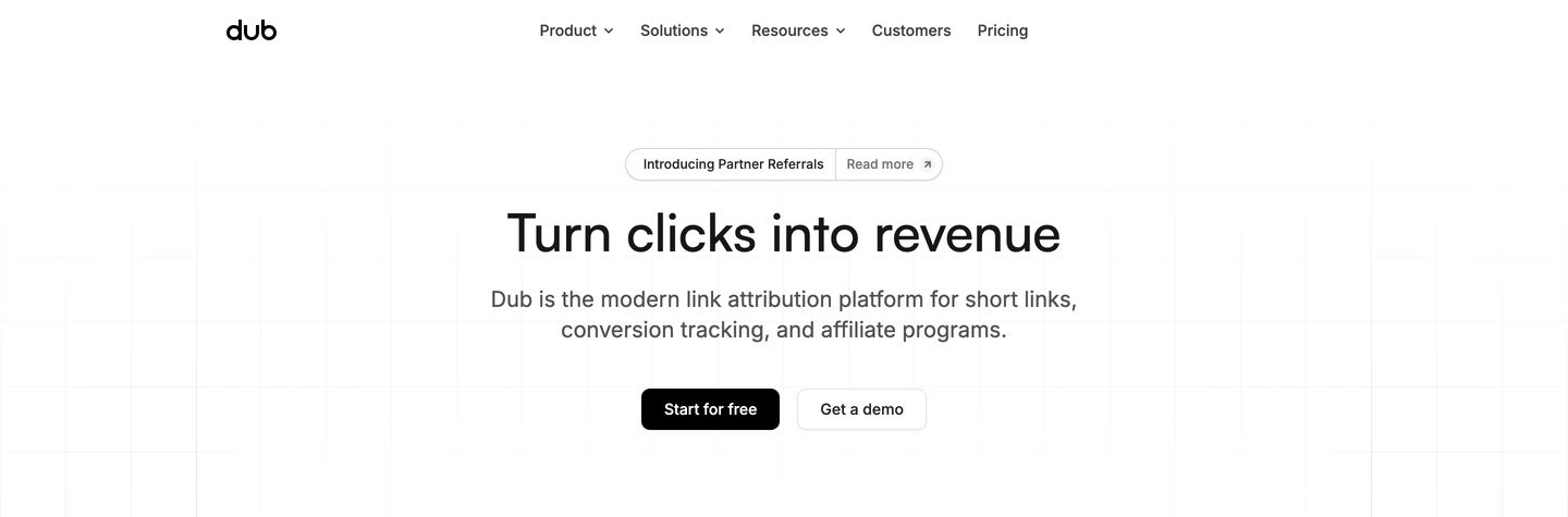
hero
Clean and restrained developer-focused hero centered on crisp typography over a faint technical grid background.
- Mood
- clinical + quiet
- Layout
- 1 col · centered · airy
- 01
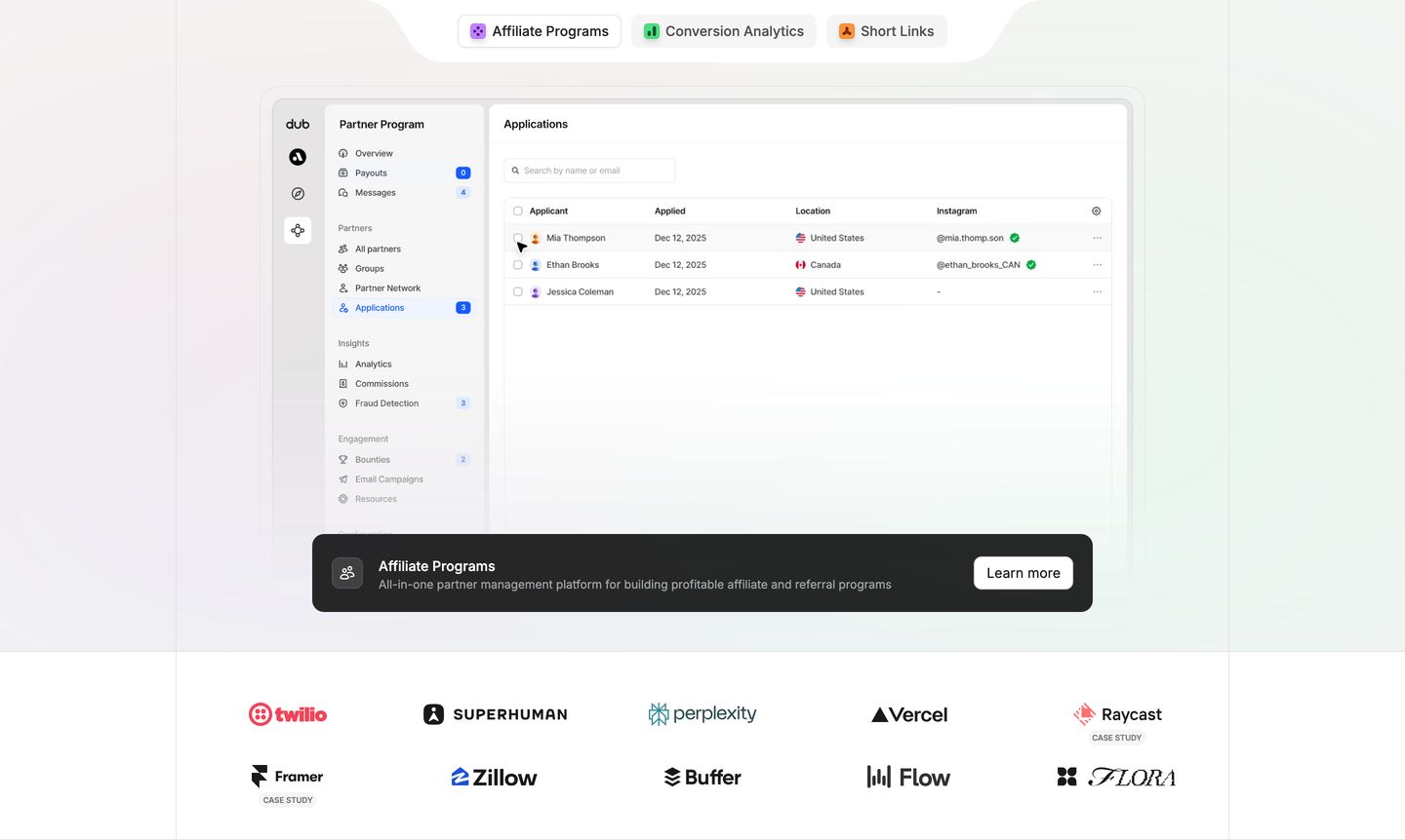
showcase
A pristine product dashboard mockup floating over subtle gridlines with an interactive tab switcher and a dark floating CTA bar.
- Mood
- clinical + quiet
- Layout
- 1 col · stacked · balanced
- 02
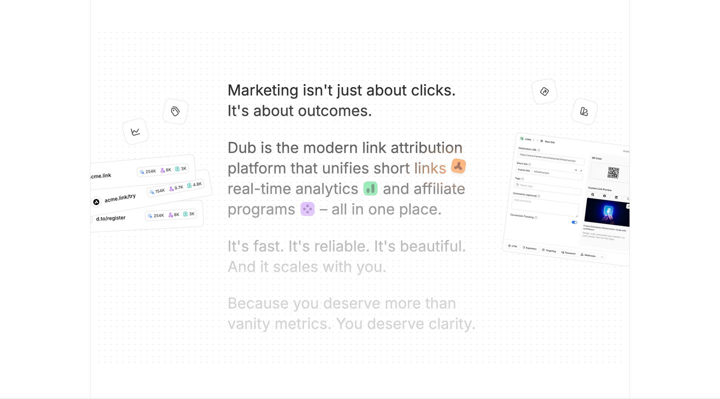
statement
A crisp product statement framed by floating UI cards and inline icon badges over a subtle dot matrix grid.
- Mood
- clinical + quiet
- Layout
- 1 col · centered · airy
- 03
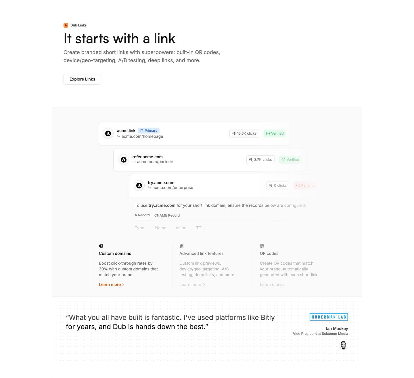
feature
Crisp, engineered SaaS feature section showcasing layered product UI components with subtle borders and precise typography.
- Mood
- clinical + quiet
- Layout
- 1 col · stacked · balanced
- 04
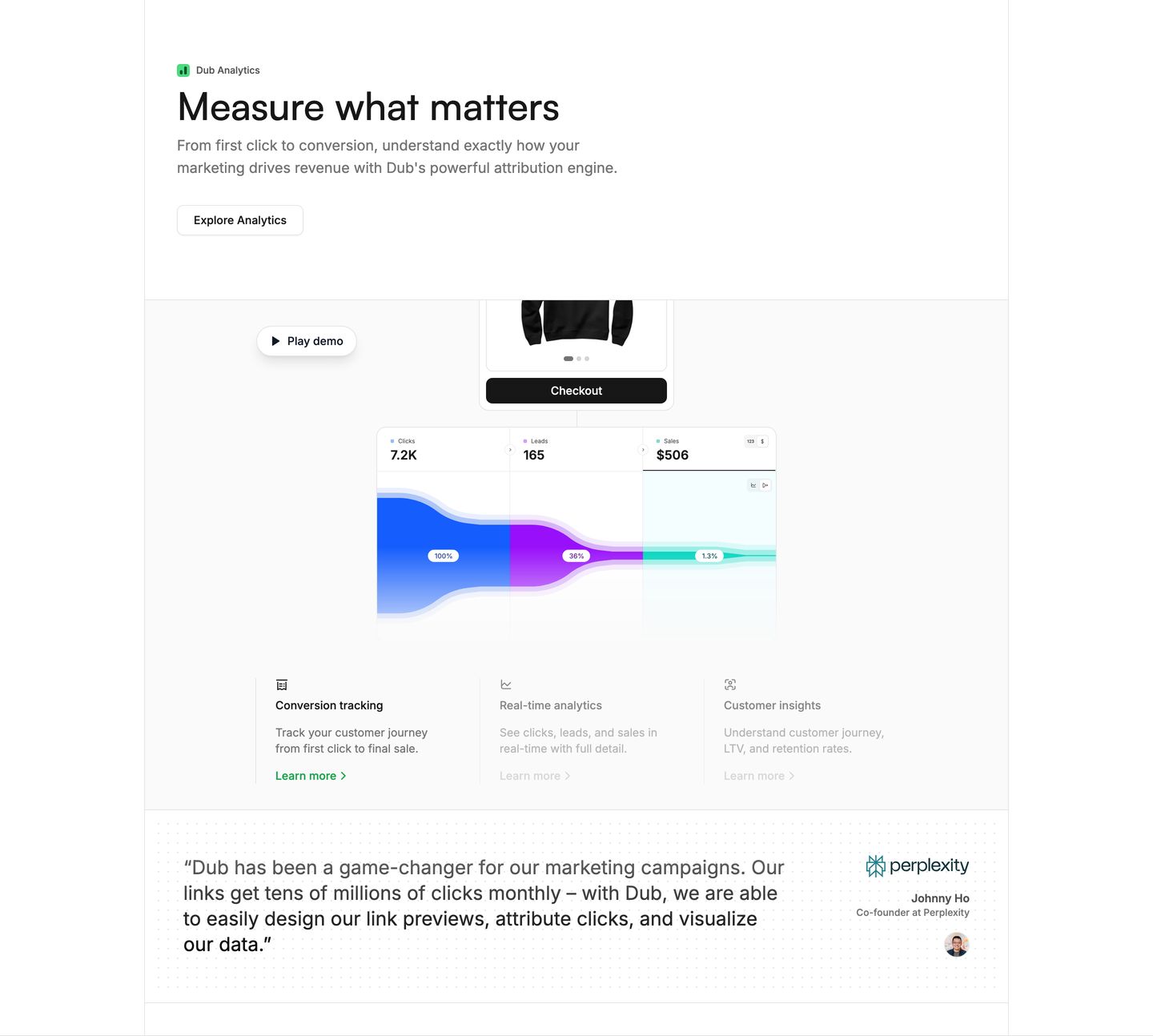
feature
Precise and modern SaaS feature showcase pairing clean typography and product UI mockups with social proof.
- Mood
- clinical + quiet
- Layout
- 1 col · stacked · balanced
- 05
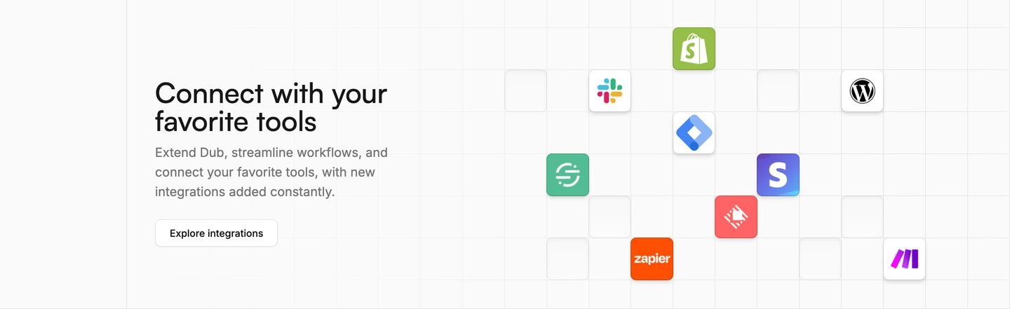
feature
Crisp and airy integration showcase pairing concise copy with colorful app tiles floating on an engineered background grid.
- Mood
- clinical + quiet
- Layout
- 16 col · split · airy
- 06
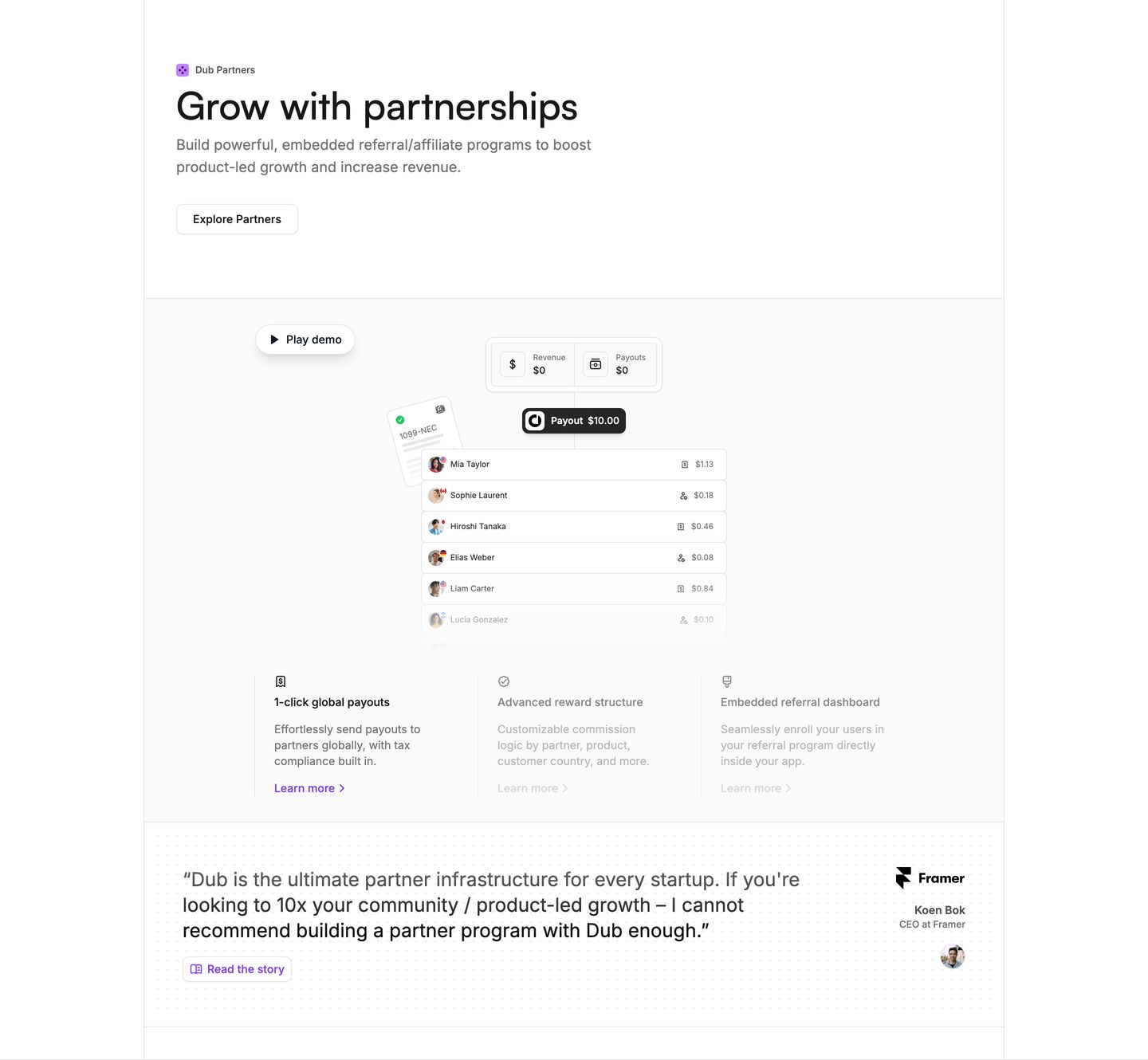
feature
Crisp, airy SaaS feature showcase with clean product UI mockups, subtle borders, and an authoritative framed testimonial card.
- Mood
- clinical + quiet
- Layout
- 1 col · stacked · airy
- 07
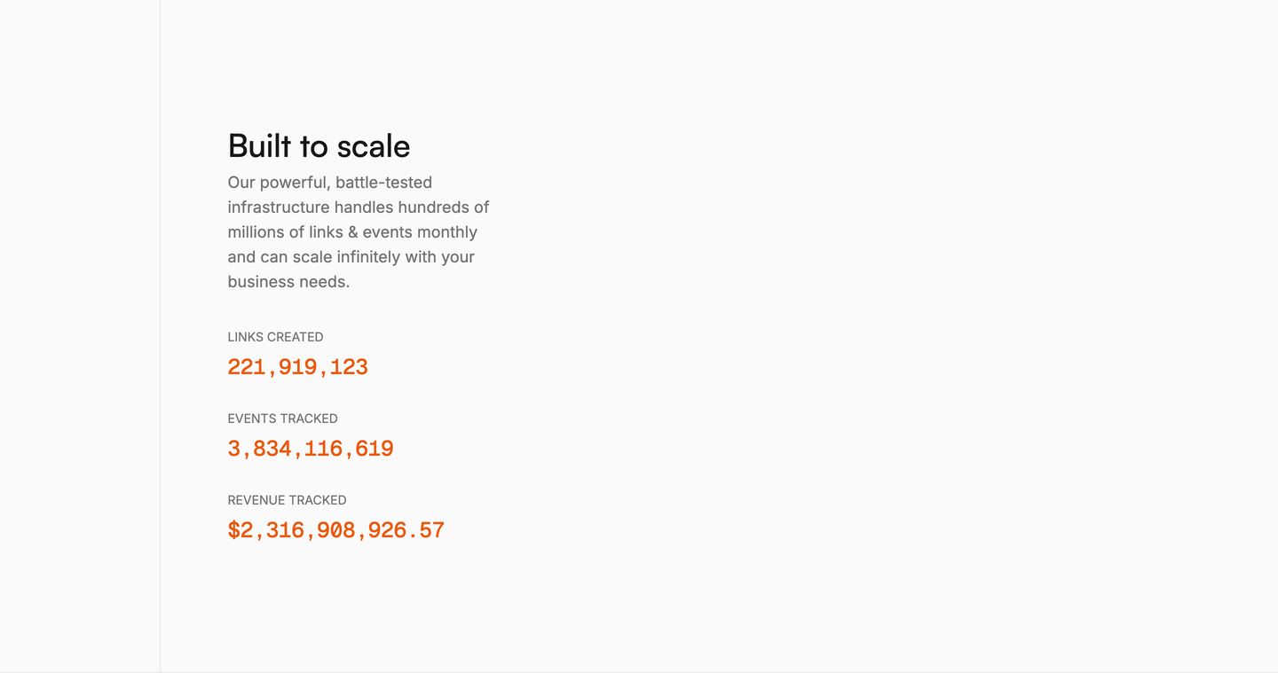
stats
Clean, restrained stats section using monospaced numerical metrics and ample whitespace to convey infrastructure reliability.
- Mood
- clinical + quiet
- Layout
- 1 col · stacked · airy
- 08
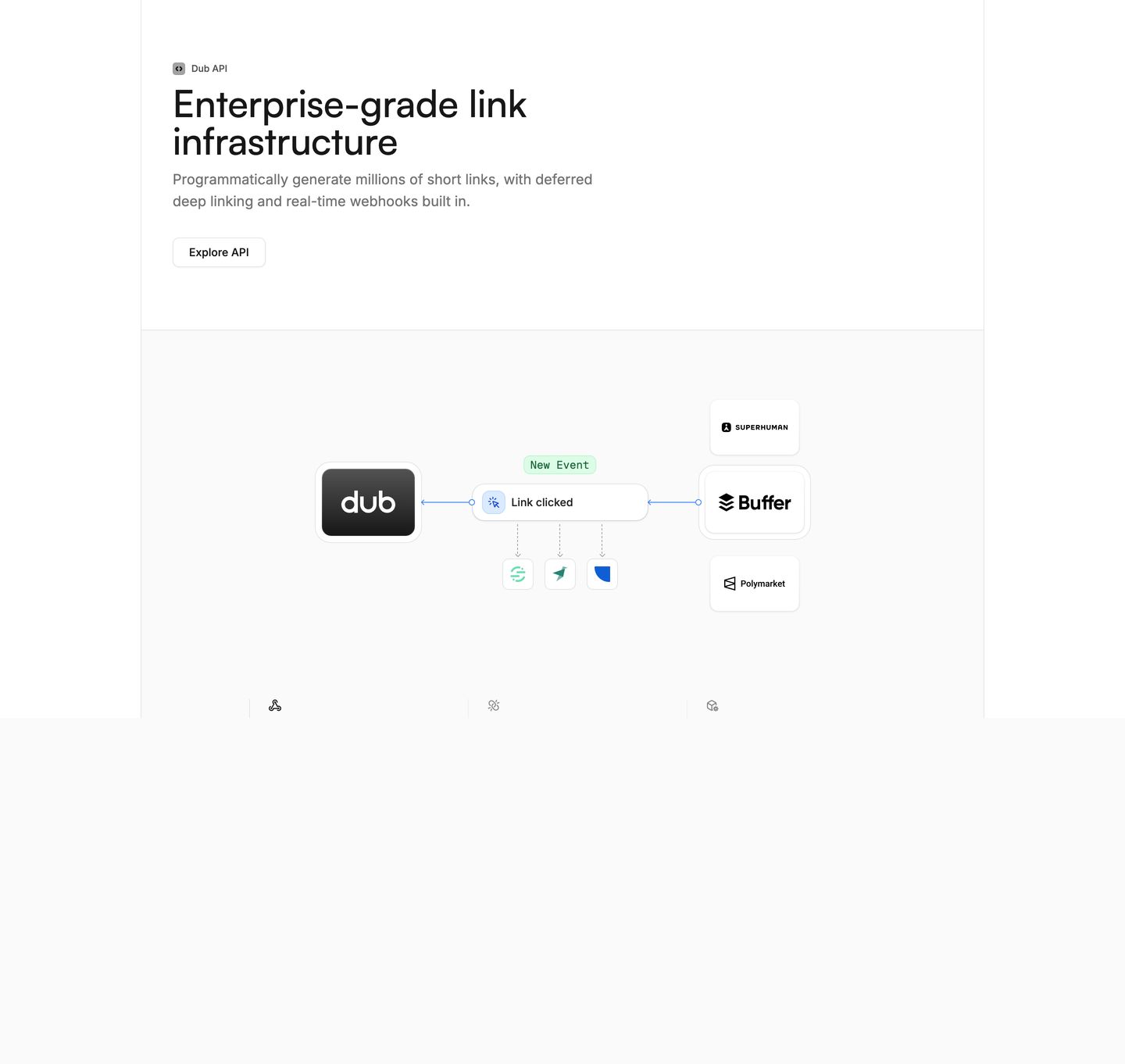
feature
Crisp and clinical developer feature section with clean system diagram nodes illustrating event-driven link infrastructure on stark white space.
- Mood
- clinical + quiet
- Layout
- 1 col · stacked · airy
More like this
by shared mood