Better Stack
Deep obsidian engineering aesthetic built on extreme dark-mode discipline and technical precision. Rich telemetry mockups and direct competitor pricing benchmarks provide unapologetic, data-dense clarity. Subtle periwinkle accents cleanly direct attention across dense grids of terminal-accurate UI components.
Visit siteColour
Typefaces
- Display
- Helvetica Now Display
- Body
- Helvetica Now Text
- Mono
- —
- Source
- self_hosted
- Scale
- 10 · 12 · 13 · 14 · 16 · 20
Layout
- Grid
- —
- Container
- —
- Spacing base
- 4px
- Radius
- 6px · 8px · 12px
Capture
- Category
- tools
- Sections
- 13
- Captured
- 2026-08-29
- Rhythm
- dark x13
Type rules
- display typography set tight in sentence case with zero tracking
- body copy and UI labels set in micro-proportions with wide measures for high data density
Colour rules
- deep obsidian and navy backgrounds maintain continuous dark mode across all sections
- periwinkle blue accent reserved exclusively for primary interactive buttons and key interactive states
Voice rules
- lead with explicit quantitative comparisons to legacy competitors
- keep feature descriptions grounded in specific developer infrastructure terminology
Holds it together
- pair every major feature headline with high-fidelity realistic UI snapshots rather than abstract illustration
- use muted card outlines to partition dense sets of micro-features across dark surfaces
- highlight financial and performance multiples explicitly against established industry incumbents
Contrast
Type, measured
- Body
- 10px / 1.45
- Measure
- 126 characters
- Display
- 53px / 1.1
- Tracking
- 0em display
- Scale ratio
- 1.52
Voice
- Tone
- direct, technical, competitive
- Sentences
- short
- Person
- second
- Vocabulary
- technical
- Calls to action
- start, explore, book, sign up
Built with
- Builder
- —
- Framework
- —
- Motion
- —
- WebGL
- —
- Nav
- top_bar, 45 items
- Length
- 13 screens
Sections in page order
3 marked strong · 13- 00
hero
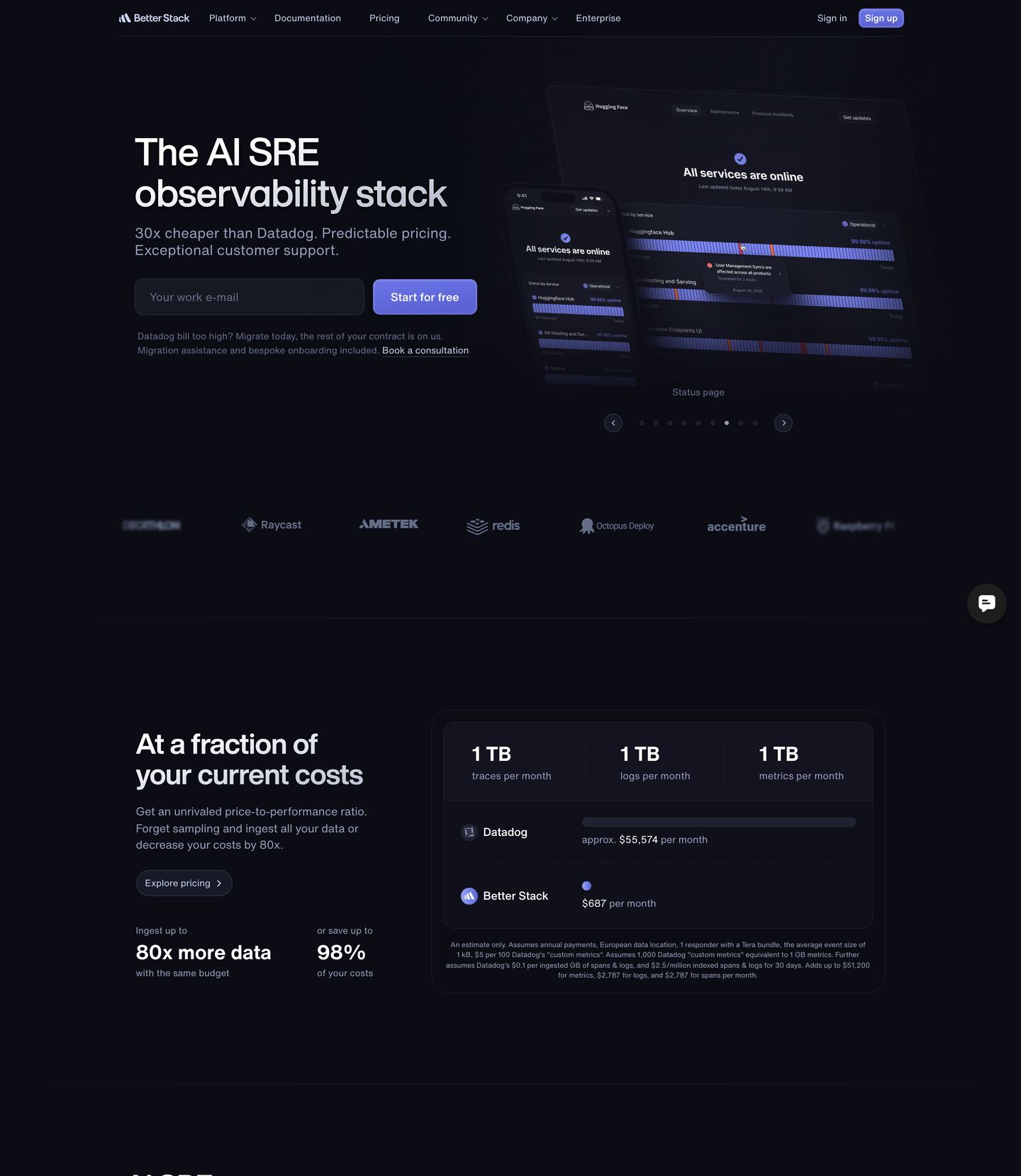
A sharp, engineered dark-mode SaaS hero and comparison block pairing high-contrast typography with precision UI mockups and direct competitor pricing benchmarks.
- Mood
- clinical + bold
- Layout
- 14 col · stacked · balanced
- 01
feature grid
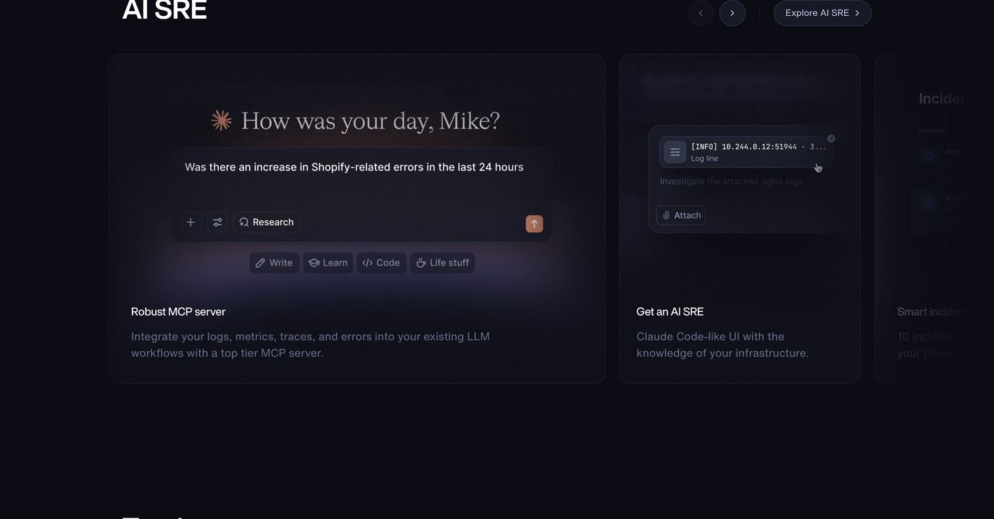
StrongDeep obsidian cards glowing with subtle ambient light present conversational AI interfaces and developer infrastructure tools.
- Mood
- clinical + dreamy
- Layout
- 1 col · grid · balanced
- 02
feature
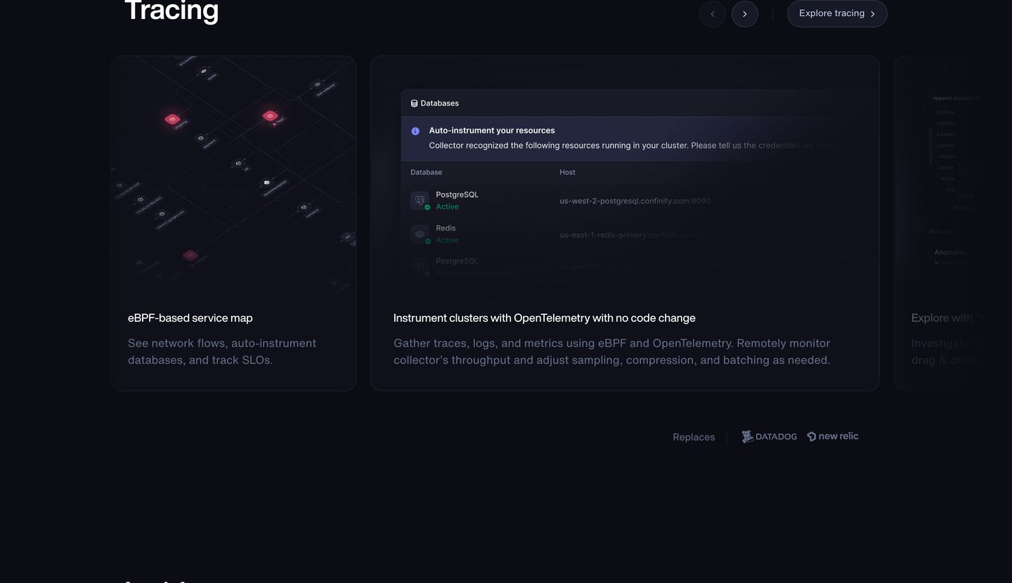
Precise dark-mode dev-tool feature showcase with glowing UI mockups in rounded cards and understated technical typography.
- Mood
- clinical + quiet
- Layout
- 1 col · stacked · balanced
- 03
feature grid
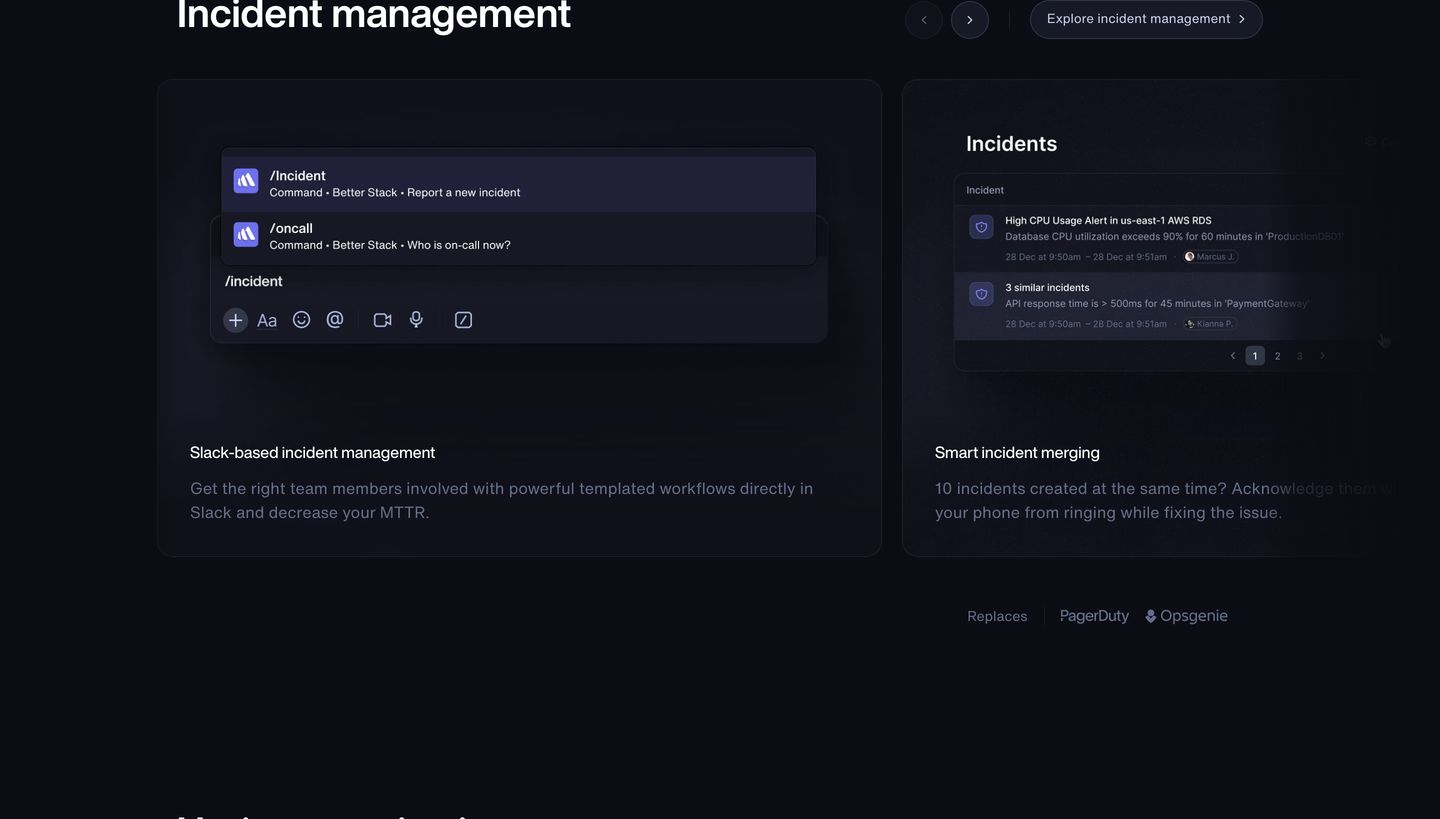
StrongSleek dark-mode feature cards showcase incident management workflows through precise UI mockups and subtle typography.
- Mood
- clinical + quiet
- Layout
- 2 col · grid · balanced
- 04
showcase
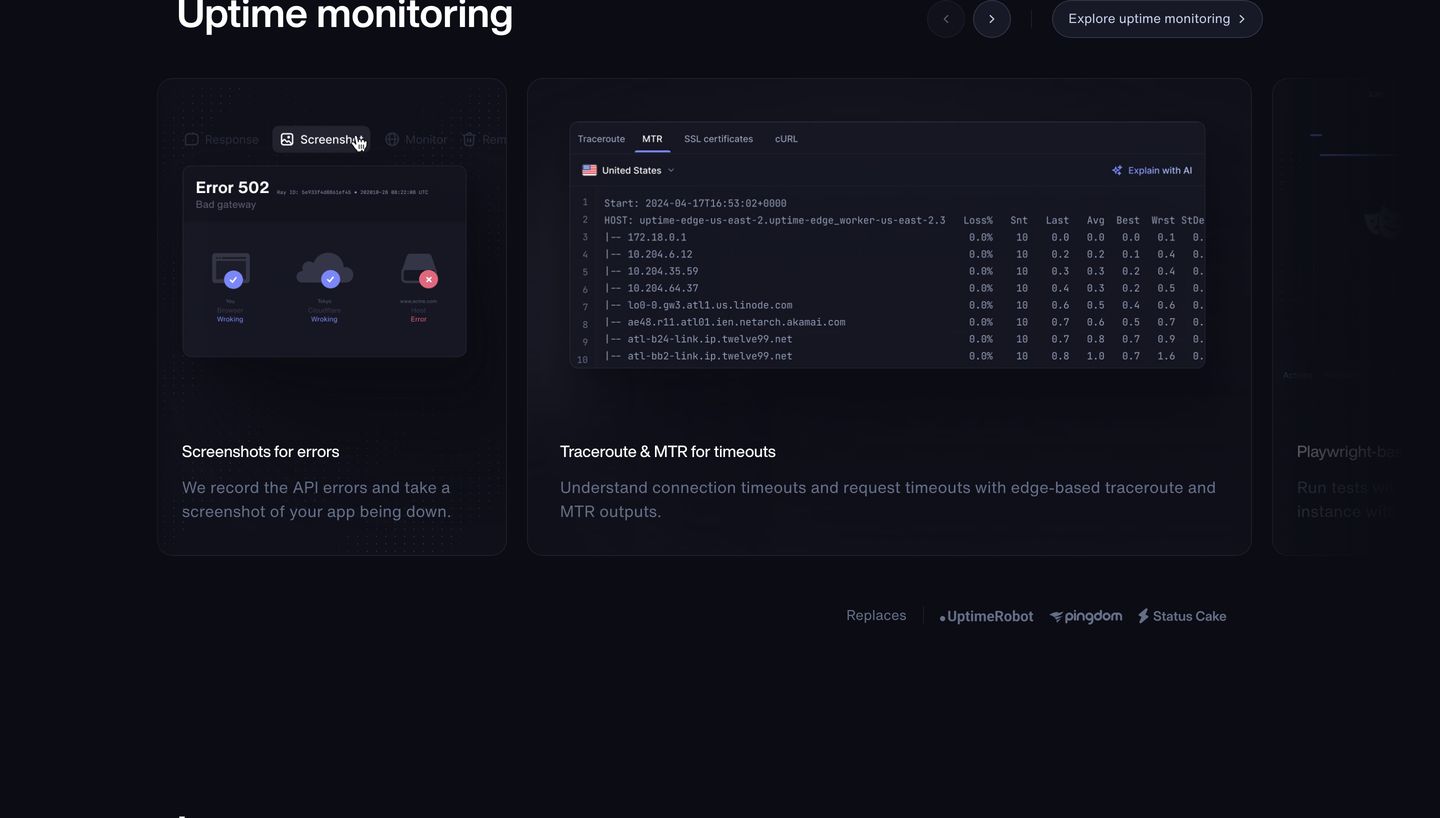
Precise dark-mode product feature carousel showcasing diagnostic tooling and terminal interfaces with high technical fidelity.
- Mood
- clinical + quiet
- Layout
- 1 col · grid · balanced
- 05
feature
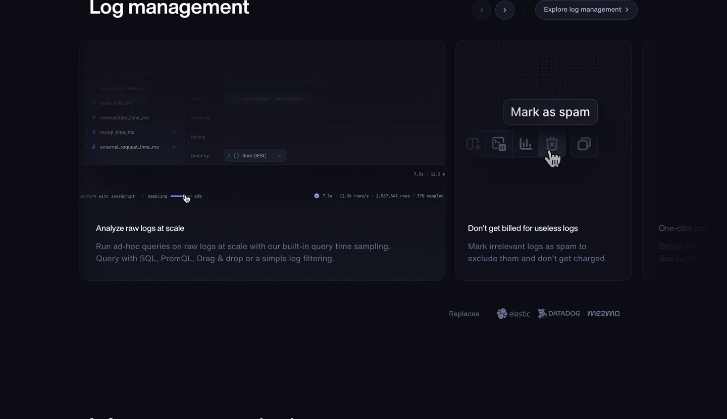
Dark, sleek developer tool feature carousel presenting interactive UI mockups within disciplined rounded cards.
- Mood
- clinical + quiet
- Layout
- 1 col · split · balanced
- 06
feature grid
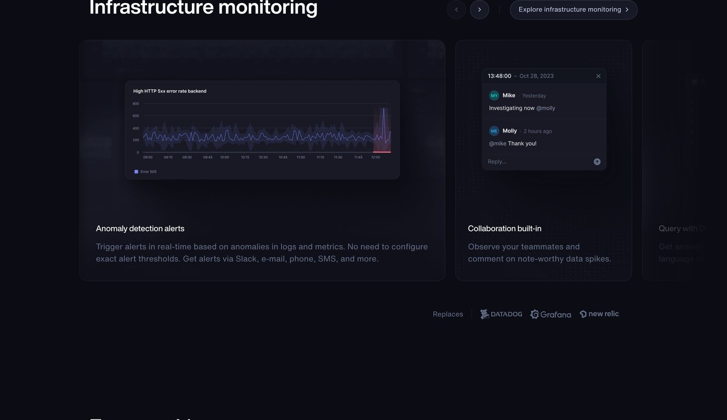
StrongA refined, dark-mode developer carousel showcasing monitoring features through muted UI cards and subtle interface telemetry.
- Mood
- clinical + quiet
- Layout
- 1 col · grid · balanced
- 07
feature grid
Sleek dark-mode developer tools showcase featuring structured modular cards with product UI snippets and layered 3D iconography.
- Mood
- clinical + quiet
- Layout
- 1 col · grid · balanced
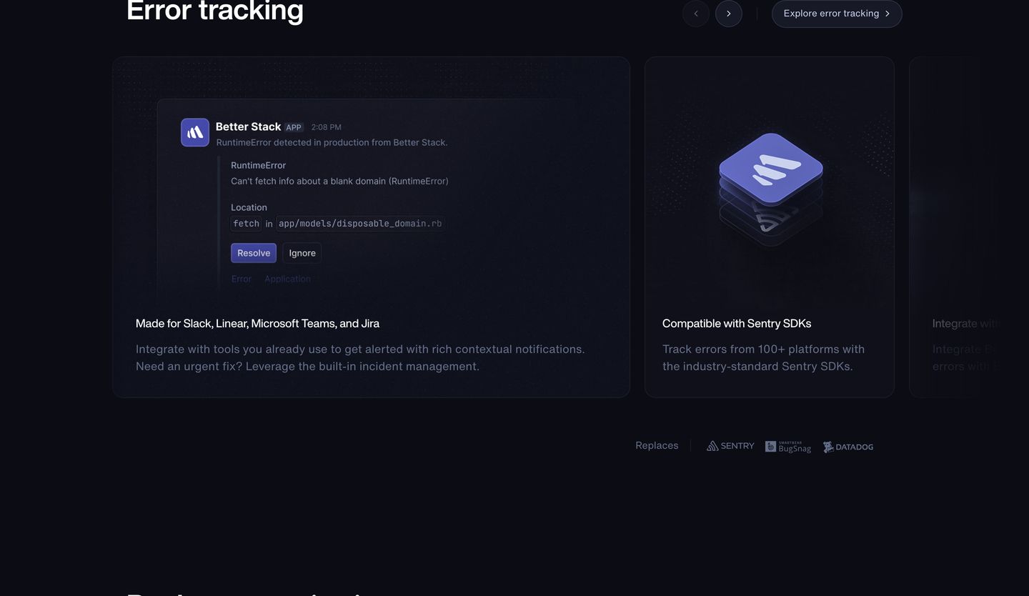
- 08
feature
Deep navy engineering interface showcasing modular product features inside sleek, low-contrast UI cards.
- Mood
- clinical + quiet
- Layout
- 1 col · grid · dense
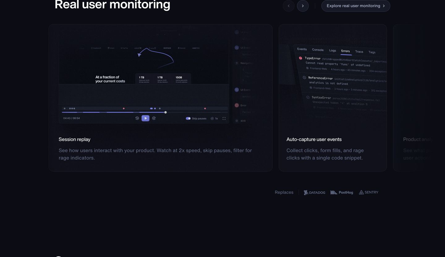
- 09
feature grid
A dark, clinical carousel of UI preview cards displaying status page features and developer tool integrations with subtle blue depth.
- Mood
- clinical
- Layout
- 1 col · grid · balanced
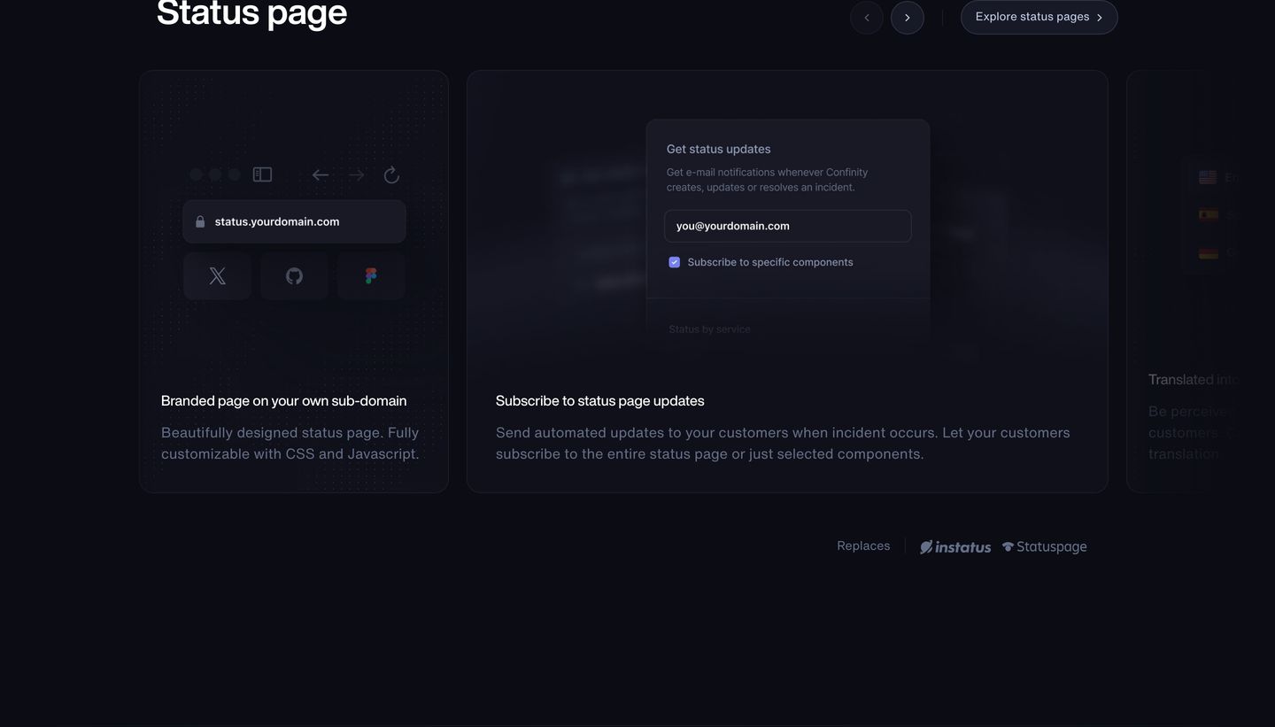
- 10
cta
A dark, clinical conversion block pairing a direct signup form with a technical quadrant matrix proving market leadership.
- Mood
- clinical + quiet
- Layout
- 2 col · split · balanced
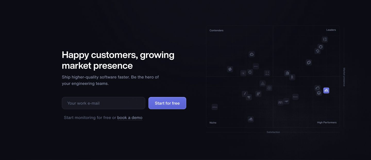
- 11
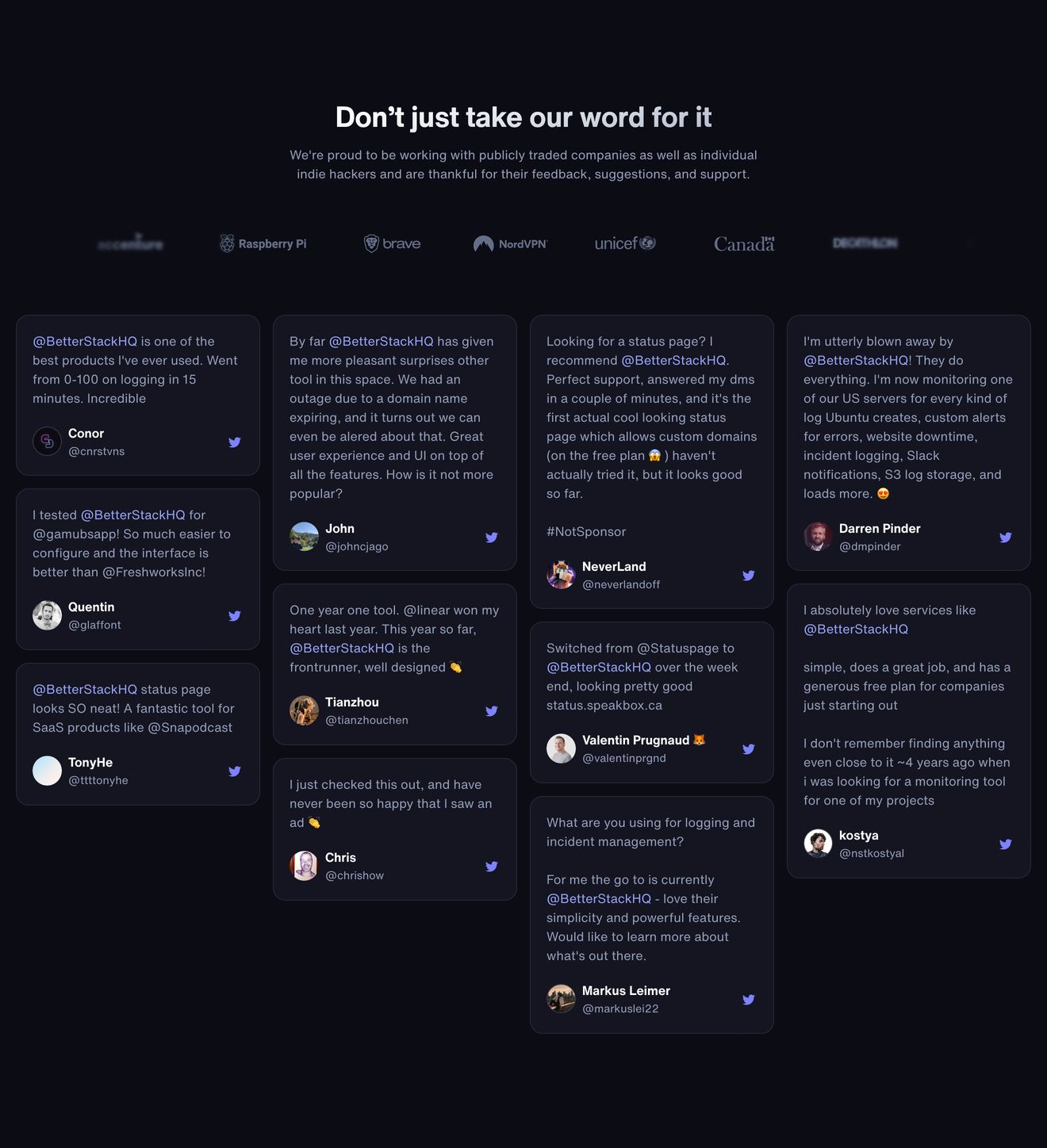
testimonial
Dark, dense wall of social proof pairing low-contrast enterprise logos with an extensive grid of community tweets.
- Mood
- clinical + quiet
- Layout
- 4 col · grid · dense
- 12
footer
A clean, dark developer SaaS footer organized into meticulous link columns with subtle hierarchy and comprehensive utility links.
- Mood
- clinical + quiet
- Layout
- 16 col · grid · balanced