Studio Herrstrom
An uncompromising, editorial studio showcase built entirely on an absolute black canvas. Razor-sharp uppercase display typography and fine modular borders frame hyper-saturated client imagery without interface ornament. The feeling is culturally prestigious, disciplined, and unapologetically bold.
Take the vibe
Rated
6.8/ 10
From 7 analyzed sections. Two measured components and one judged by a model. Distinction is a rank within the library; the rest are scores in their own right.
- AI scorejudged
- 9.3
- Systemmeasured
- 4.9
- Distinctionmeasured
- 4.1
- on the grid
- 43%
- vertical rhythm
- 47%
- type on a scale
- 56%
- contrast passing AA
- 50%
- unlike the library
- 0.64
- model craft
- 7.9/10
- model deviation
- 5.4/10
Color
Background#000000
Text#ffffff
Surface#000000
Muted#5a5a5a
Typefaces
- Display
- SH-MIX
- Body
- SH-SANS
- Mono
- —
- Source
- self_hosted
- Scale
- 9 · 10 · 14 · 15 · 22 · 28
Layout
- Grid
- 16 columns
- Container
- 720px
- Spacing base
- 8px
- Radius
- 0px
Capture
- Category
- studio
- Sections
- 7
- Captured
- 2026-09-10
- Rhythm
- dark x6
Type rules
- display headlines set in uppercase SH-MIX with negative tracking (-0.016em) and tight 0.9 line height
- body text in SH-SANS at 15px with tight leading (1.1) and compact measure up to 85 characters
Color rules
- pure monochrome interface (#000000 and #ffffff) letting client case study media supply all color
- secondary metadata and tags set in muted #5a5a5a
Voice rules
- set major section headlines in high-contrast uppercase serif
- limit project descriptions to a single active sentence
Holds it together
- maintain pure black (#000000) as the universal canvas across every section
- separate all interactive cards and grid modules with 1px hairline borders
- render display headlines in centered or modular uppercase display type
Contrast
text on background21.0:1 AAA
muted text on background3.0:1 AA Large
text on surface21.0:1 AAA
muted text on surface3.0:1 AA Large
Type, measured
- Body
- 15px / 1.1
- Measure
- 85 characters
- Display
- 64px / 0.9
- Tracking
- -0.016em display
- Scale ratio
- 1.44
Voice
- Tone
- authoritative, curated, direct
- Sentences
- short
- Person
- first
- Vocabulary
- industry-specific
- Calls to action
- view, join, review, load
Built with
- Builder
- —
- Framework
- —
- Motion
- —
- WebGL
- —
- Nav
- sticky_top_bar, 10 items, sticky
- Length
- 7.4 screens
Sections in page order
- 00
hero
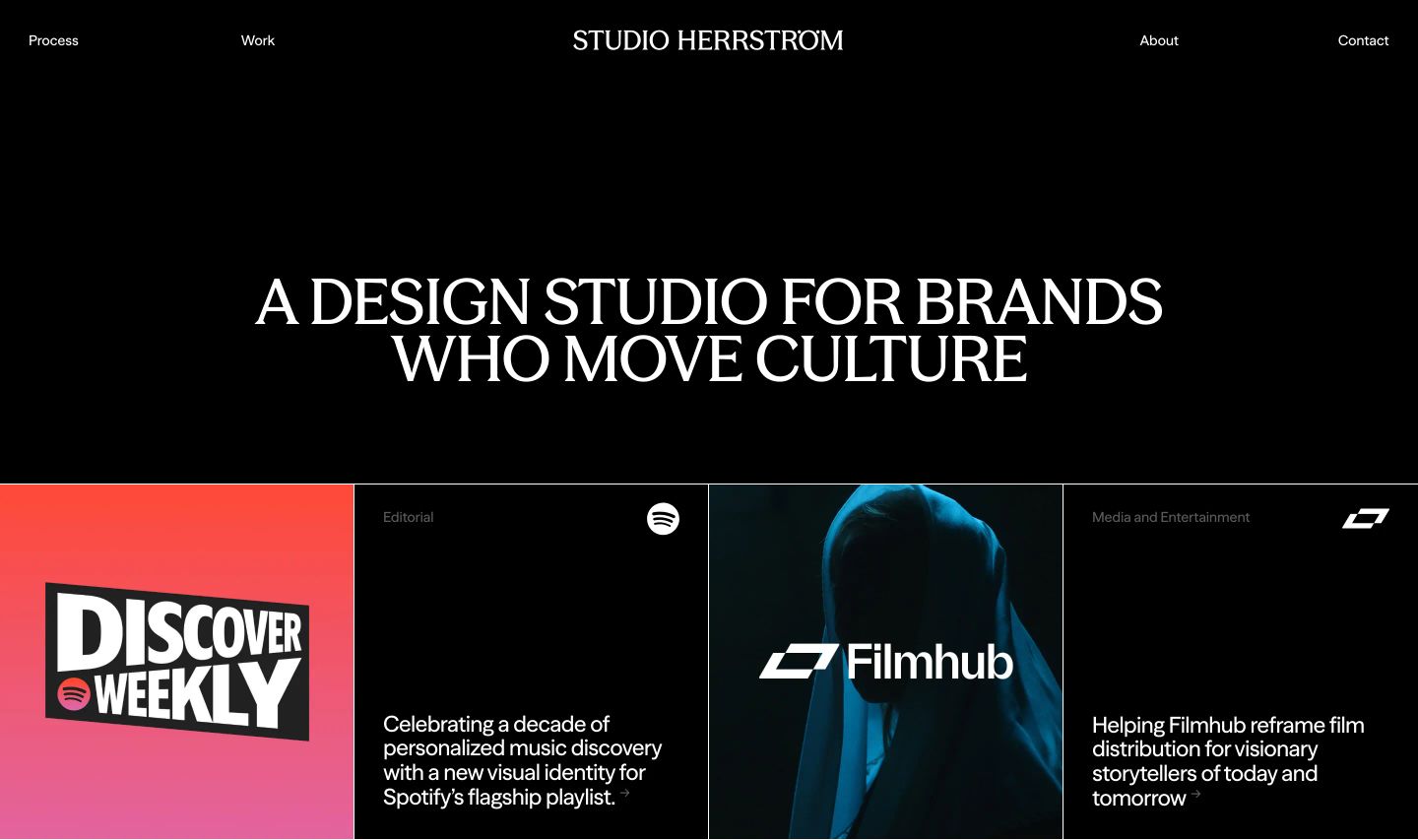
Stark black background with a bold centered uppercase headline leading into a disciplined grid of client case studies.
- Mood
- luxurious + serene
- Layout
- 4 col · stacked · airy
- 01
hero
StrongStark split-screen hero balancing a bottom-anchored typographic statement against a bold blue brand visual.
- Mood
- serene
- Layout
- 2 col · split · airy

- 02
showcase
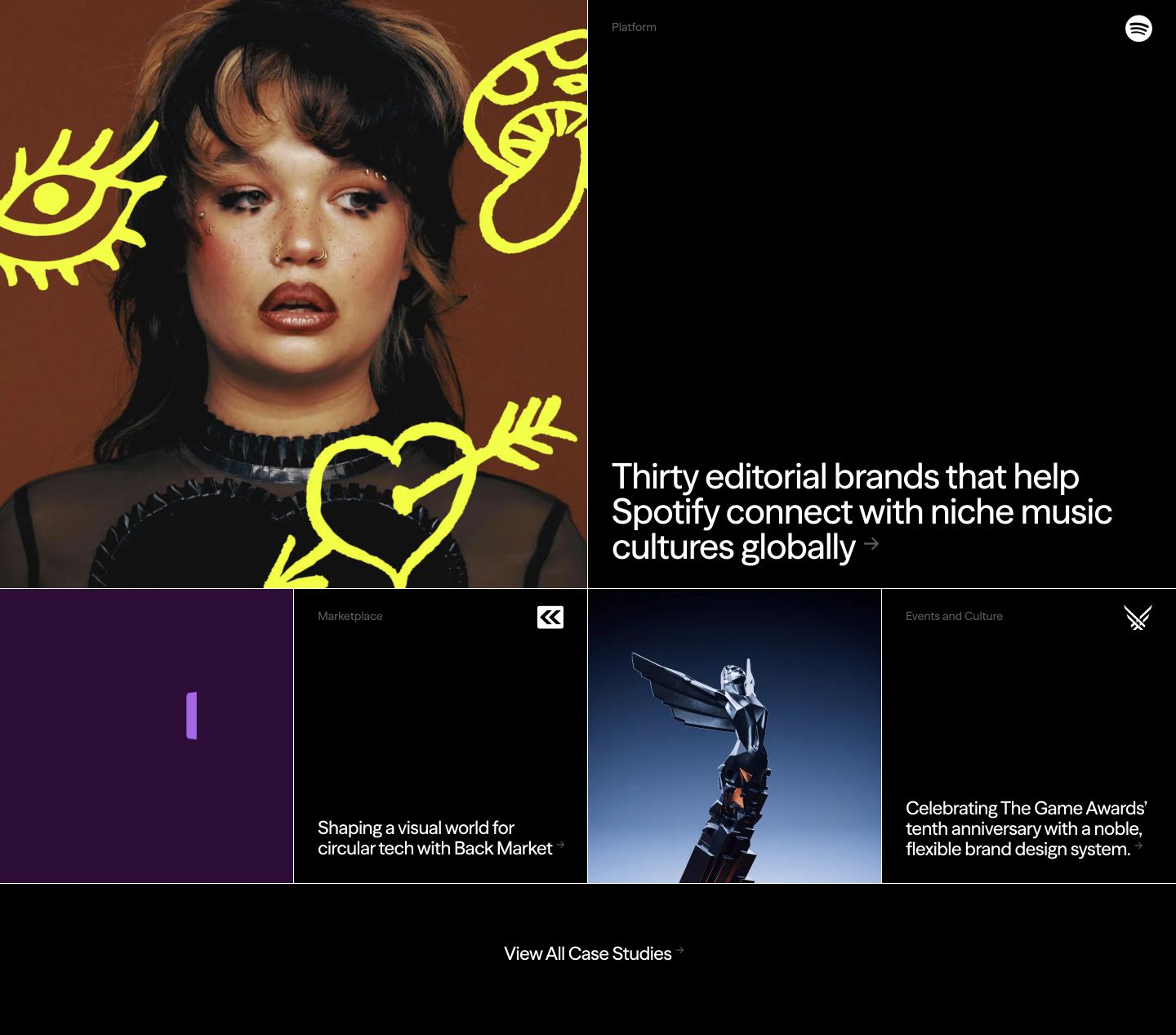
StrongBold culture-forward case study showcase balancing expressive portrait doodles against a stark, high-contrast dark grid.
- Mood
- playful
- Layout
- 2 col · grid · balanced
- 03
feature grid
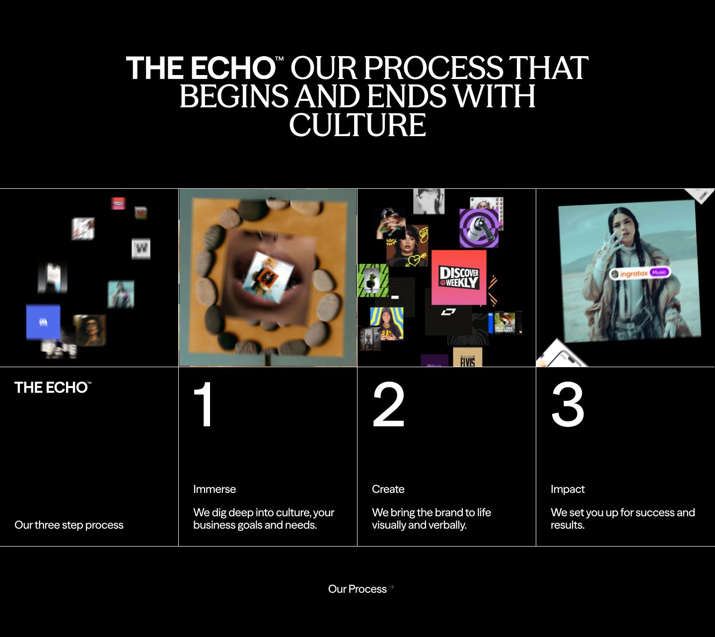
StrongStark editorial dark grid mapping a three-step creative agency process under high-contrast hairline borders and cultural collage imagery.
- Mood
- mysterious + energetic
- Layout
- 4 col · grid · balanced
- 04
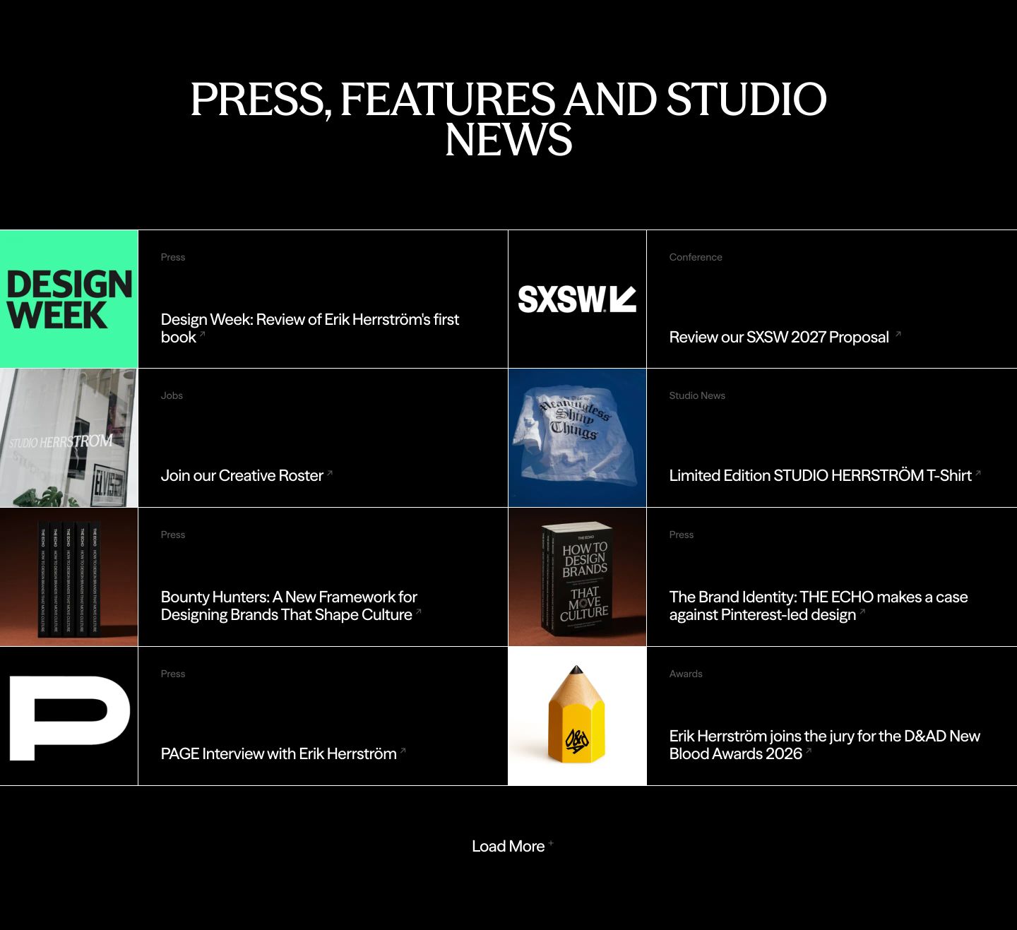
announcement
A stark, structured modular grid index cataloging press mentions and studio news with high-contrast monochrome precision.
- Mood
- luxurious + clinical
- Layout
- 4 col · grid · dense
- 05
statement
A stark typographic question floating in vast black space, forcing an unhurried pause.
- Mood
- serene + luxurious
- Layout
- 1 col · centered · airy
- 06
footer
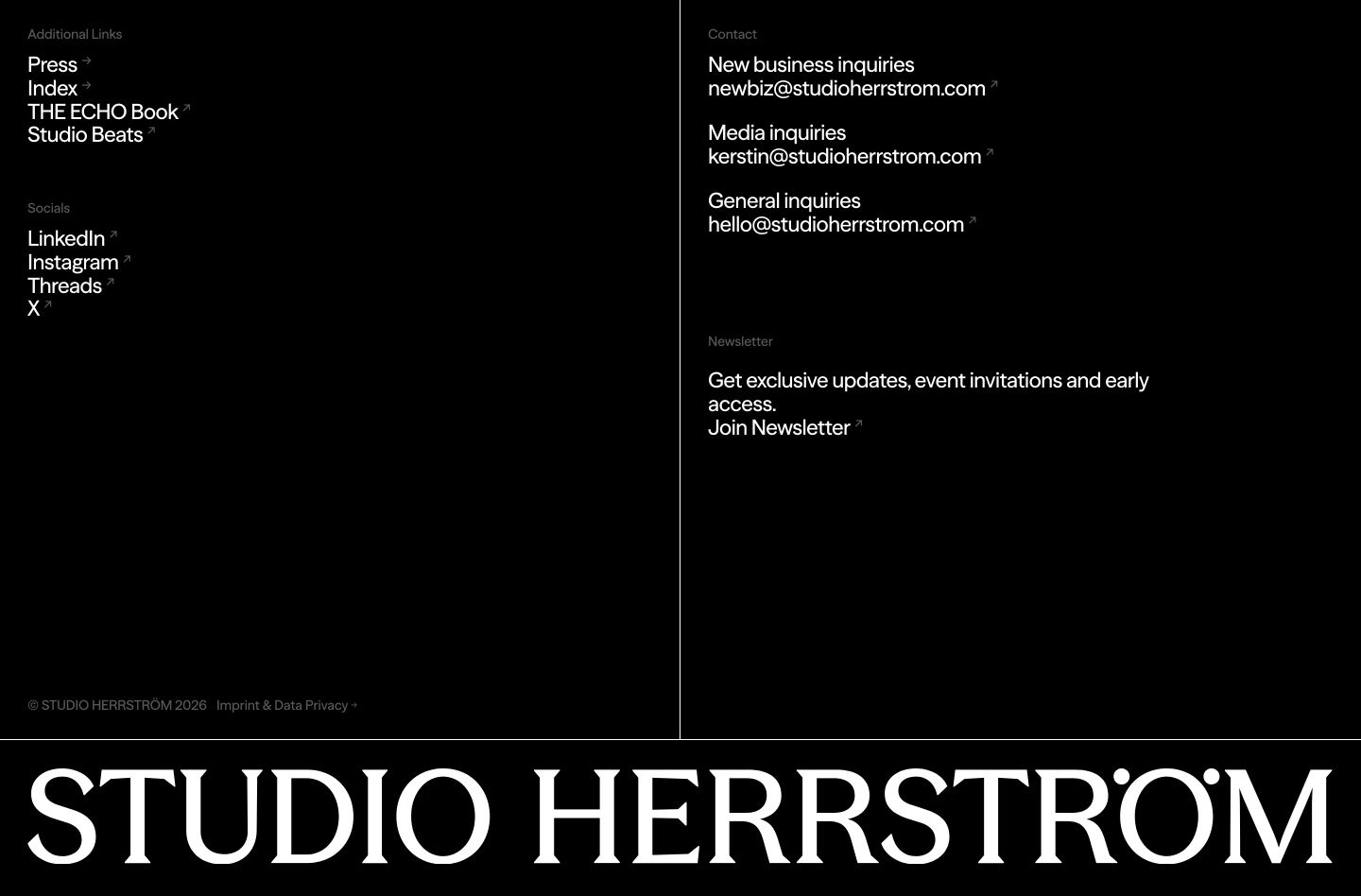
Monochrome dark footer with generous negative space, delicate hairline grid dividers, and an oversized brand logotype anchoring the bottom.
- Mood
- serene + luxurious
- Layout
- 2 col · split · airy