Poch
Irreverent, surreal, and stylishly editorial. A pitch-black canvas hosts playful 3D collages, bubbly pink highlights, and crisp multi-column case studies that balance agency craft with a DIY sense of humor.
Take the vibe
Rated
6.1/ 10
From 7 analyzed sections. Two measured components and one judged by a model. Distinction is a rank within the library; the rest are scores in their own right.
- AI scorejudged
- 9.0
- Systemmeasured
- 3.1
- Distinctionmeasured
- 5.2
- on the grid
- 0%
- vertical rhythm
- 0%
- type on a scale
- 57%
- contrast passing AA
- 67%
- unlike the library
- 0.72
- model craft
- 7.7/10
- model deviation
- 5.6/10
Color
Background#000000
Text#ffffff
Accent#ffa5c6
Surface#ececeb
Muted#4f4f4f
Typefaces
- Display
- Season Sans SemiBold
- Body
- Season Sans SemiBold
- Mono
- —
- Source
- Scale
- 12 · 14 · 17 · 20 · 25 · 50
Layout
- Grid
- —
- Container
- —
- Spacing base
- 5px
- Radius
- 20px · 30px · 999px
Capture
- Category
- studio
- Sections
- 7
- Captured
- 2026-08-29
- Rhythm
- dark x9
Type rules
- display headlines set in sentence case with tight line height
- body text runs in multi-column editorial blocks averaging around 50 characters per line
- category and filter tags rendered in compact pill badges
Color rules
- background remains absolute pitch-black throughout all sections
- bubble-gum pink acts as the primary standout accent for highlight cards and stickers
- text is predominantly crisp white with muted grey details
Voice rules
- use colloquial, friendly phrasing without agency jargon
- keep CTA copy action-oriented and approachable
Holds it together
- maintain pure black background across every section without container breaks
- use pill-shaped container badges for metadata, tags, and interactive links
- isolate high-impact pink only for the most prominent offer card, sticker, or accent element
Contrast
text on background21.0:1 AAA
muted text on background2.6:1 fail
text on surface1.2:1 fail
muted text on surface6.9:1 AA
accent on background11.4:1 AAA
background on accent11.4:1 AAA
Type, measured
- Body
- 12px / 1.3
- Measure
- 51 characters
- Display
- 150px / 1
- Tracking
- 0em display
- Scale ratio
- 1.88
Voice
- Tone
- playful, candid, casual
- Sentences
- medium
- Person
- first
- Vocabulary
- informal
- Calls to action
- get, see, book, call
Built with
- Builder
- framer
- Framework
- —
- Motion
- —
- WebGL
- —
- Nav
- top_bar, 3 items
- Length
- 8 screens
Sections in page order
- 00
showcase
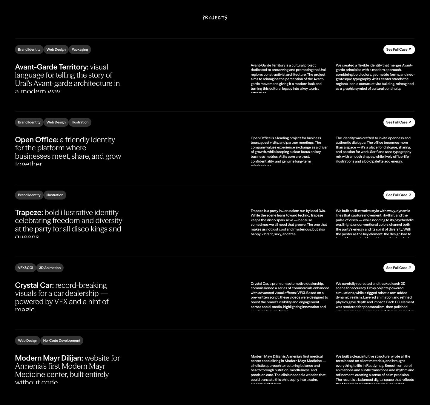
StrongMonochrome, text-heavy project index with stark contrast, pill tags, and structured horizontal rows against pitch black.
- Mood
- clinical + serene
- Layout
- 3 col · stacked · balanced
- 01
feature grid
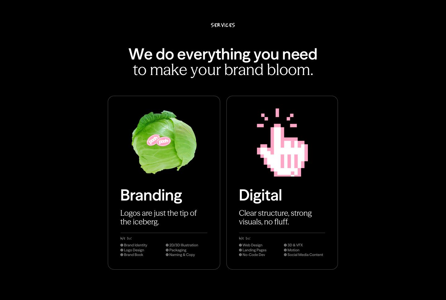
StrongCrisp dark services grid pairing surreal tactile objects and pixel art with elegant editorial typography.
- Mood
- whimsical + playful
- Layout
- 2 col · grid · balanced
- 02
cta
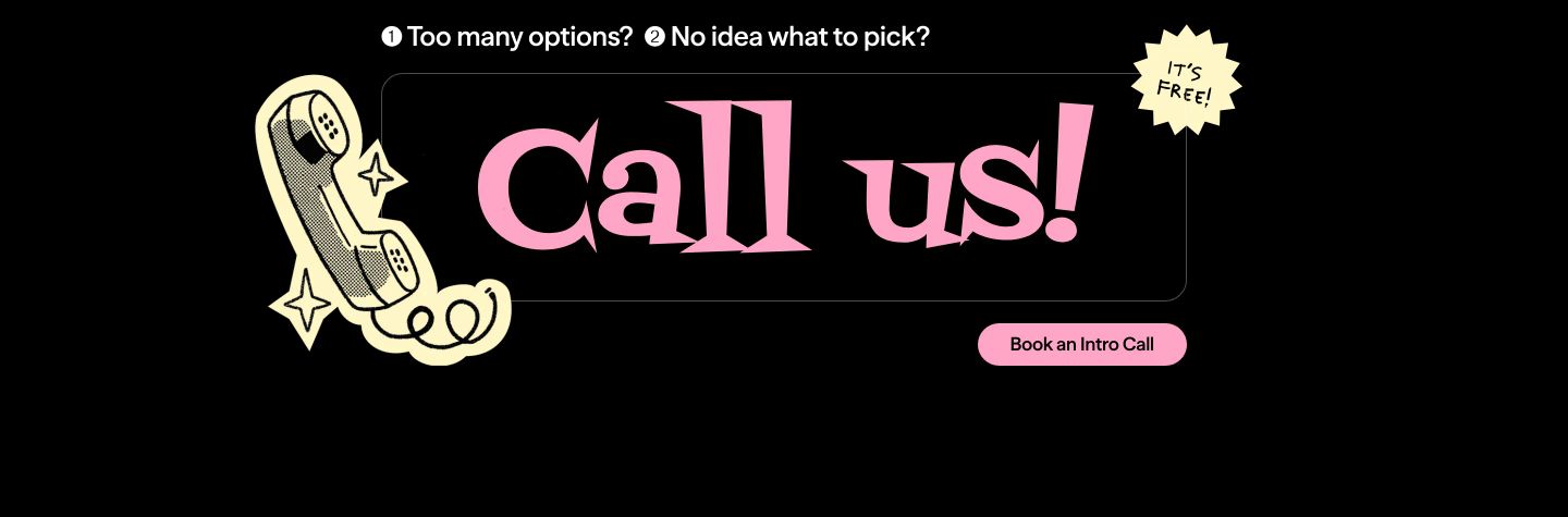
A high-contrast retro pop callout featuring stylized flared typography, a vintage handset illustration, and an offbeat starburst badge.
- Mood
- playful + nostalgic
- Layout
- 1 col · centered · balanced
- 03
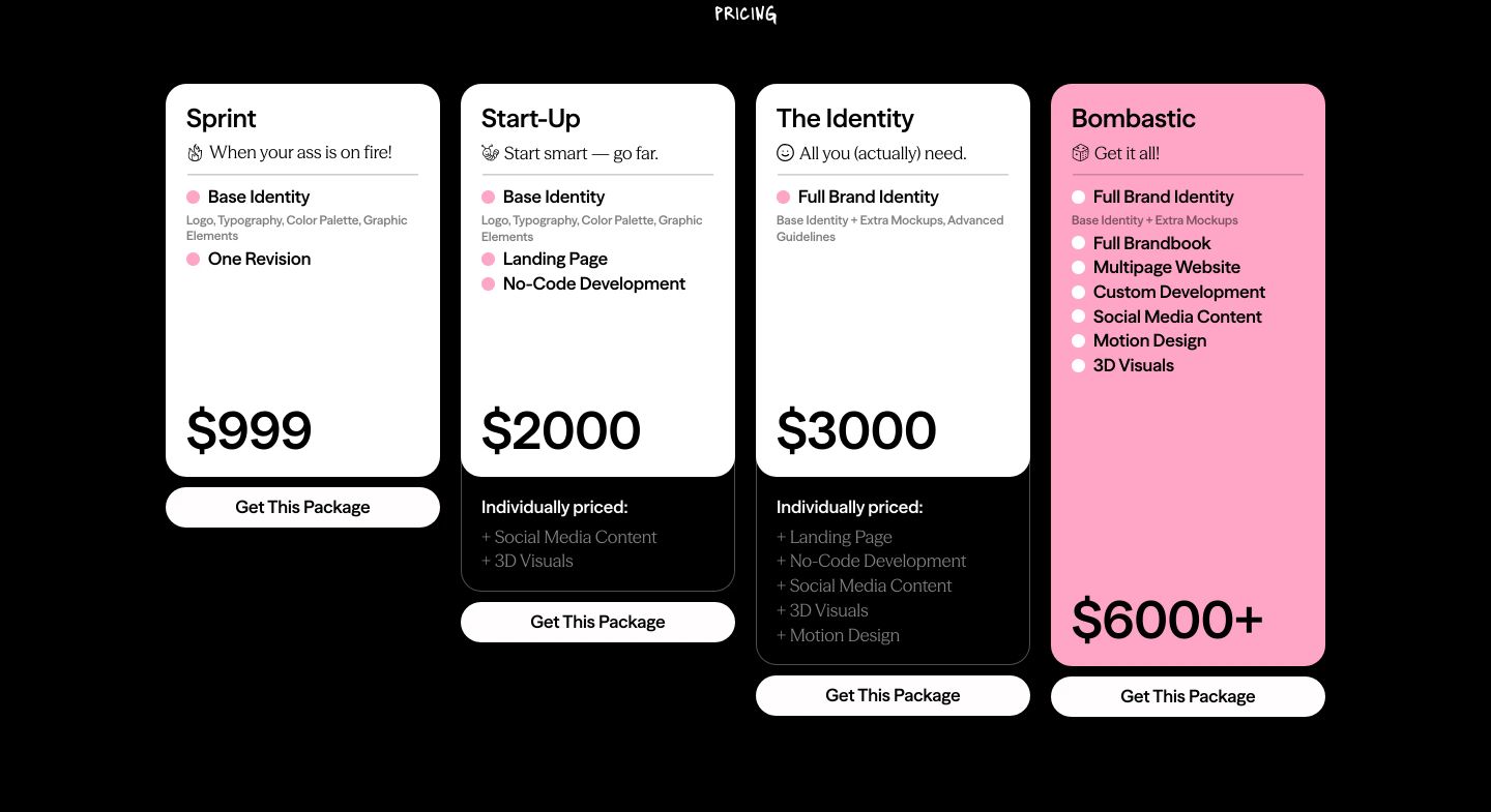
pricing
Crisp high-contrast pricing cards cascading in height across a dark canvas with cheeky copy and a punchy pink hero tier.
- Mood
- playful + energetic
- Layout
- 4 col · grid · balanced
- 04
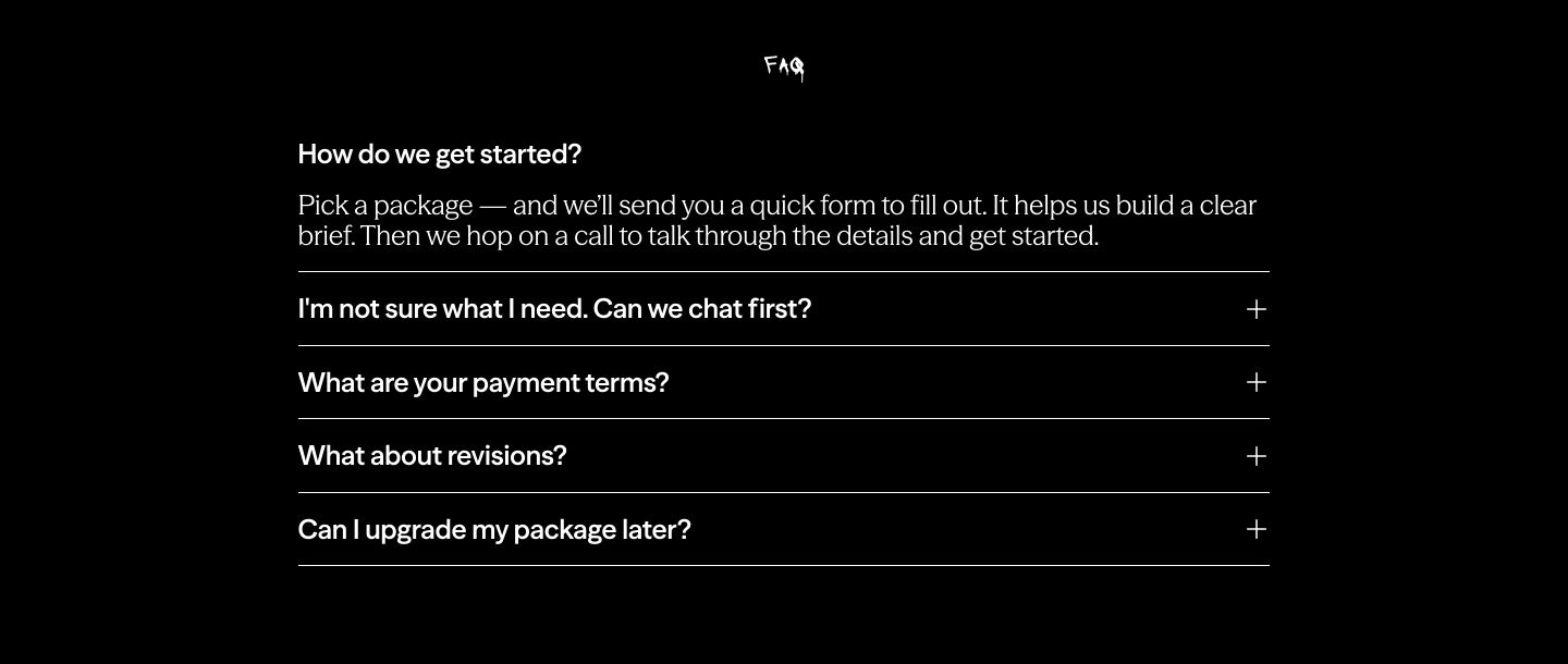
faq
A stark black accordion FAQ section with a raw hand-drawn label and crisp monochromatic typography.
- Mood
- serene
- Layout
- 1 col · centered · balanced
- 05
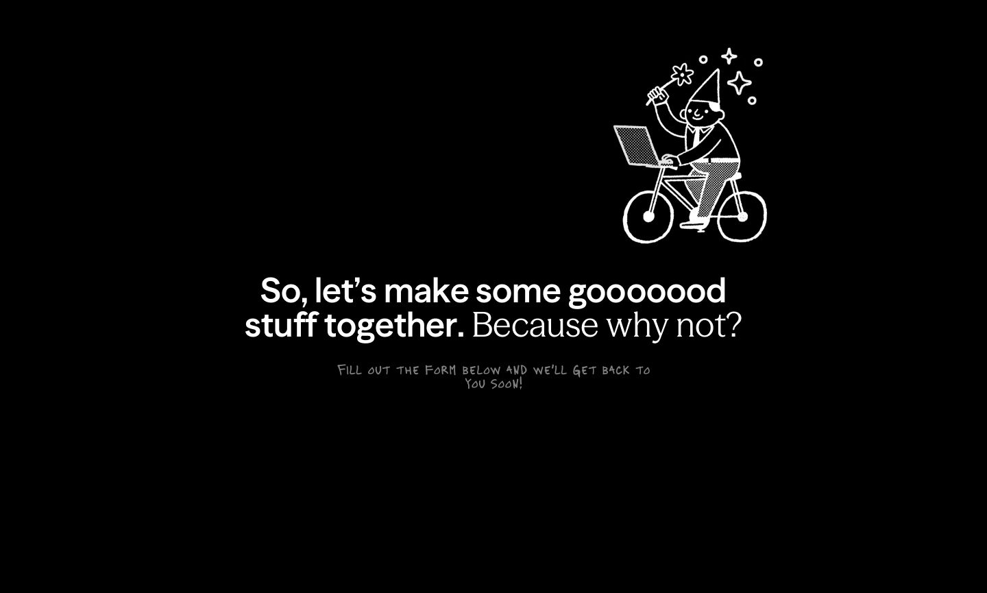
cta
A whimsical monochrome call-to-action set against deep black, pairing casual conversational copy with a quirky line-drawn cyclist wizard.
- Mood
- whimsical + playful
- Layout
- 1 col · stacked · airy
- 06
footer
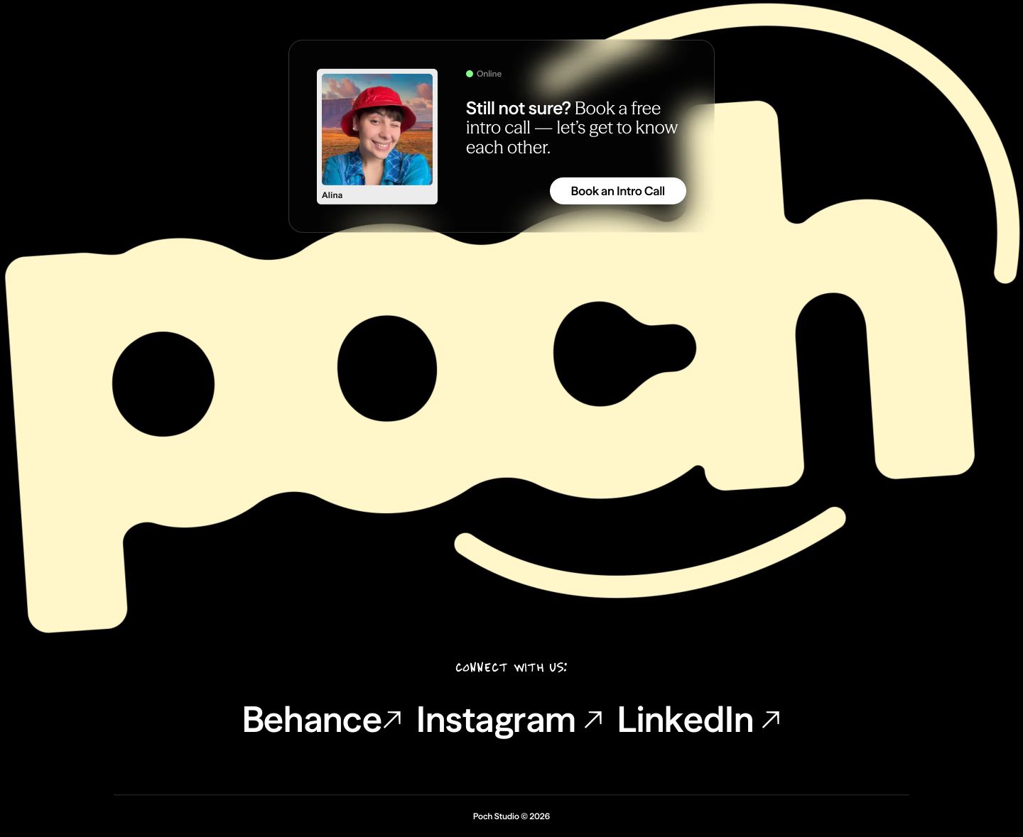
StrongPlayful dark footer anchored by an oversized wavy logo mark layered beneath a floating glassmorphic call-to-action card.
- Mood
- playful + whimsical
- Layout
- 1 col · stacked · balanced