Madiyour
An intimate, diary-like digital showcase built inside rounded dark containers. Warm ambient lighting in the hero contrasts against a low-key charcoal theme, creating a personal space that balances professional UI experience with unfiltered personal tastes.
Take the vibe
Rated
6.6/ 10
From 9 analyzed sections. Two measured components and one judged by a model. Distinction is a rank within the library; the rest are scores in their own right.
- AI scorejudged
- 7.2
- Systemmeasured
- 6.5
- Distinctionmeasured
- 5.0
- on the grid
- 35%
- vertical rhythm
- 61%
- type on a scale
- 63%
- contrast passing AA
- 100%
- unlike the library
- 0.70
- model craft
- 6.9/10
- model deviation
- 3.9/10
Color
Background#121212
Text#ffffff
Accent#70d4ff
Surface#181818
Muted#fafafa
Typefaces
- Display
- Switzer
- Body
- Inter
- Mono
- —
- Source
- Scale
- 10 · 14 · 15 · 16 · 18 · 20
Layout
- Grid
- 12 columns
- Container
- 1252px
- Spacing base
- 8px
- Radius
- 16px · 24px
Capture
- Category
- portfolio
- Sections
- 9
- Captured
- 2026-09-11
- Rhythm
- dark x12
Type rules
- display headlines set in sentence case with tight negative tracking (-0.04em)
- body text runs in lightweight sans-serif with comfortable line spacing
Color rules
- dark surface cards (#181818) sit on an almost identical dark canvas (#121212)
- white text dominates with pure white (#ffffff) for primary headlines
Voice rules
- first-person informal prose across all descriptive copy
- category labels placed directly above conversational headlines
Holds it together
- enclose every content segment in a standalone rounded dark card
- pair professional credentials with personal lifestyle artifacts like music, setup gear, and photography
- use conversational first-person phrases for section headers instead of generic corporate titles
Contrast
text on background18.7:1 AAA
muted text on background17.9:1 AAA
text on surface17.8:1 AAA
muted text on surface17.0:1 AAA
accent on background11.2:1 AAA
background on accent11.2:1 AAA
Type, measured
- Body
- 14px / 1.6
- Measure
- 153 characters
- Display
- 34px / 1.1
- Tracking
- -0.04em display
- Scale ratio
- 1.25
Voice
- Tone
- candid, casual, introspective
- Sentences
- medium
- Person
- first
- Vocabulary
- conversational
- Calls to action
- reach out, view, contact
Built with
- Builder
- framer
- Framework
- —
- Motion
- —
- WebGL
- —
- Nav
- —
- Length
- 7.3 screens
Sections in page order
- 00
hero
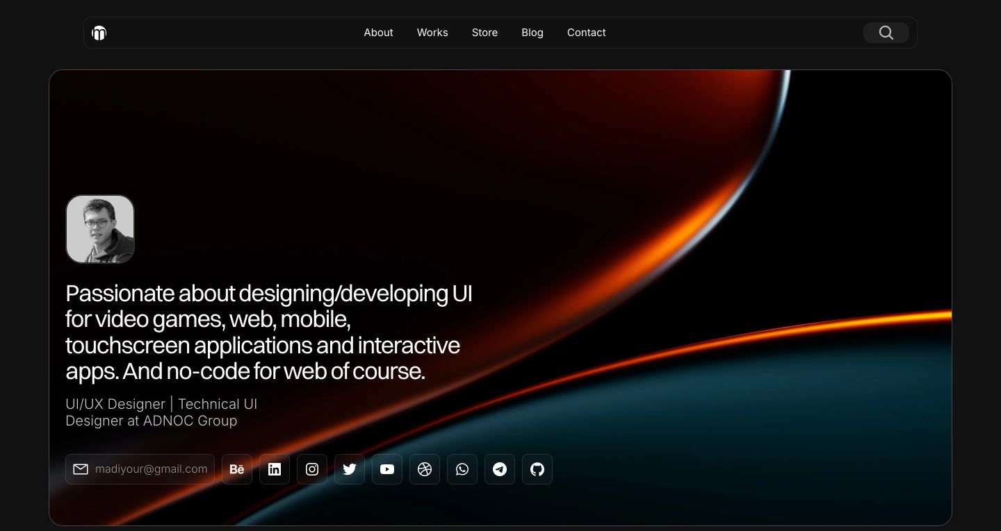
StrongSleek dark portfolio hero framed in a rounded card, featuring glowing copper 3D ribbon artwork behind a personal introduction.
- Mood
- luxurious + mysterious
- Layout
- 2 col · split · balanced
- 01
feature grid
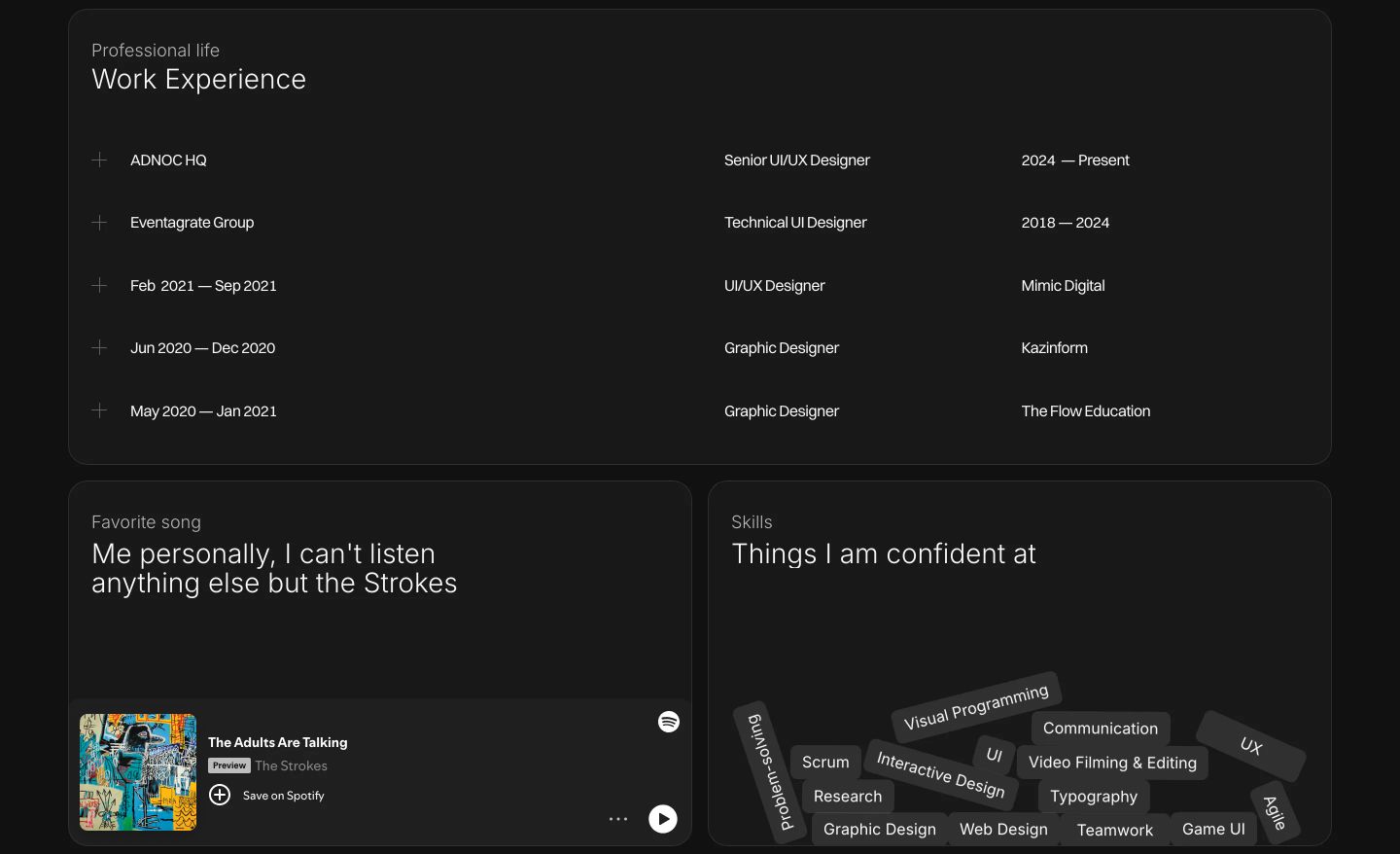
StrongA dark, restrained personal portfolio bento grid featuring structured work experience, a music snippet, and a playful pile of skill tags.
- Mood
- playful + serene
- Layout
- 2 col · grid · balanced
- 02
video
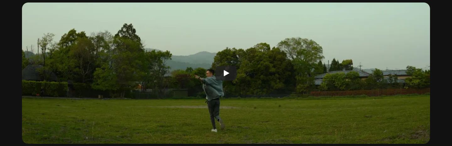
A cinematic, ultra-wide video embed capturing an unhurried outdoor scene on a clean dark canvas.
- Mood
- serene + organic
- Layout
- 1 col · centered · airy
- 03
showcase
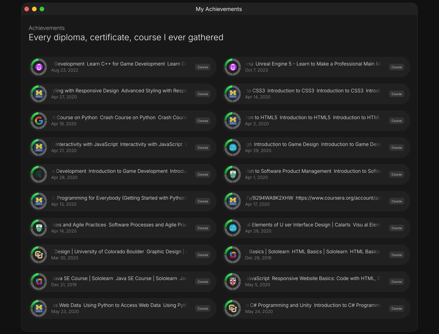
A dark, dense directory of educational certificates and credentials formatted as two columns of glowing rounded list cards.
- Mood
- clinical + serene
- Layout
- 2 col · grid · dense
- 04
feature grid
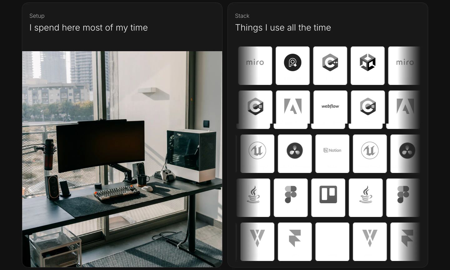
Clean dark dual-card section pairing a bright workspace setup photo with a monochrome grid of software tools.
- Mood
- serene
- Layout
- 2 col · split · balanced
- 05
feature grid
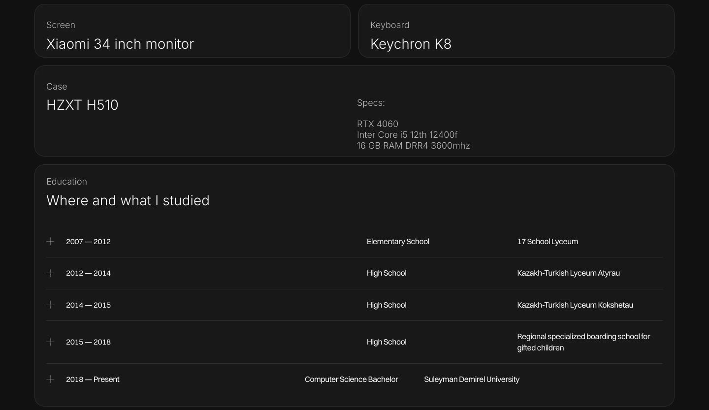
Minimal dark-mode personal specs and education list organized in modular rounded cards with clean tabular typography.
- Mood
- clinical + serene
- Layout
- 2 col · grid · balanced
- 06
showcase
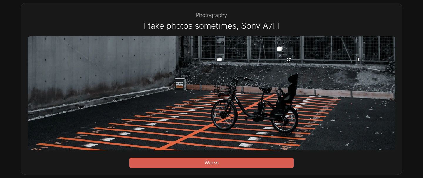
A quiet, dark showcase card framing an urban asphalt photograph beneath understated typography.
- Mood
- serene + organic
- Layout
- 1 col · stacked · balanced
- 07
statement
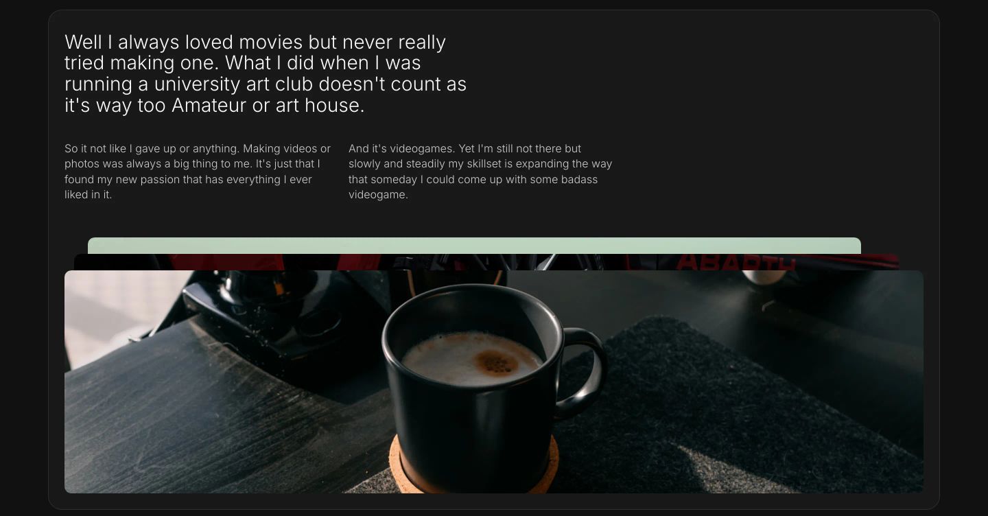
StrongAn intimate, diary-like personal narrative set against dark cards with warm, quiet photography.
- Mood
- serene + cozy
- Layout
- 2 col · stacked · balanced
- 08
footer
A quiet and subdued dark-mode contact footer housed in a rounded card with minimal typographic details and compact social links.
- Mood
- serene
- Layout
- 2 col · stacked · balanced