Delta Board
Tactile, refined, and functionally honest. Natural plywood textures and climbing imagery sit against crisp white backgrounds, grounded by clean sans-serif type and subtle warm orange inline highlights.
Take the vibe
Rated
6.3/ 10
From 8 analyzed sections. Two measured components and one judged by a model. Distinction is a rank within the library; the rest are scores in their own right.
- AI scorejudged
- 8.5
- Systemmeasured
- 4.5
- Distinctionmeasured
- 4.2
- on the grid
- 0%
- vertical rhythm
- 56%
- type on a scale
- 57%
- contrast passing AA
- 67%
- unlike the library
- 0.65
- model craft
- 7.5/10
- model deviation
- 3.9/10
Color
Background#ffffff
Text#232323
Accent#fc4c00
Surface#f7f7f7
Muted#171717
Typefaces
- Display
- Switzer
- Body
- Switzer
- Mono
- —
- Source
- self_hosted
- Scale
- 12 · 14 · 16 · 18 · 24 · 30
Layout
- Grid
- —
- Container
- —
- Spacing base
- 5px
- Radius
- 4px · 999px
Capture
- Category
- ecommerce
- Sections
- 8
- Captured
- 2026-09-15
- Rhythm
- photo → light x2 → photo x2 → light → photo → light → photo → light → dark
Type rules
- display headlines use sentence case with tight tracking
- category tags and eyebrow labels are set in uppercase sans-serif
- body measure is kept around 52 characters for effortless scanning
Color rules
- page is predominantly clean white with deep neutral charcoal text
- warm orange accent is restricted strictly to inline product mentions and arrow glyphs
Voice rules
- inline product links use an arrow glyph and warm orange tint
- CTAs use uppercase imperative verbs inside pill containers
Holds it together
- use pill-shaped outline or solid buttons for all primary calls to action
- highlight inline product references with orange text and trailing arrows
- frame product photography in high-aspect rounded cards over white backgrounds
- use uppercase marquee ribbons to separate core product narrative blocks
Contrast
text on background15.7:1 AAA
muted text on background17.9:1 AAA
text on surface14.7:1 AAA
muted text on surface16.7:1 AAA
accent on background3.4:1 AA Large
background on accent3.4:1 AA Large
Type, measured
- Body
- 16px / 1.6
- Measure
- 52 characters
- Display
- 100px / 1
- Tracking
- -0.024em display
- Scale ratio
- 1.58
Voice
- Tone
- confident, practical, refined
- Sentences
- short
- Person
- second
- Vocabulary
- plain
- Calls to action
- explore, discover, learn, meet
Built with
- Builder
- —
- Framework
- —
- Motion
- —
- WebGL
- —
- Nav
- top_bar, 0 items
- Length
- 9.4 screens
Sections in page order
- 00
hero
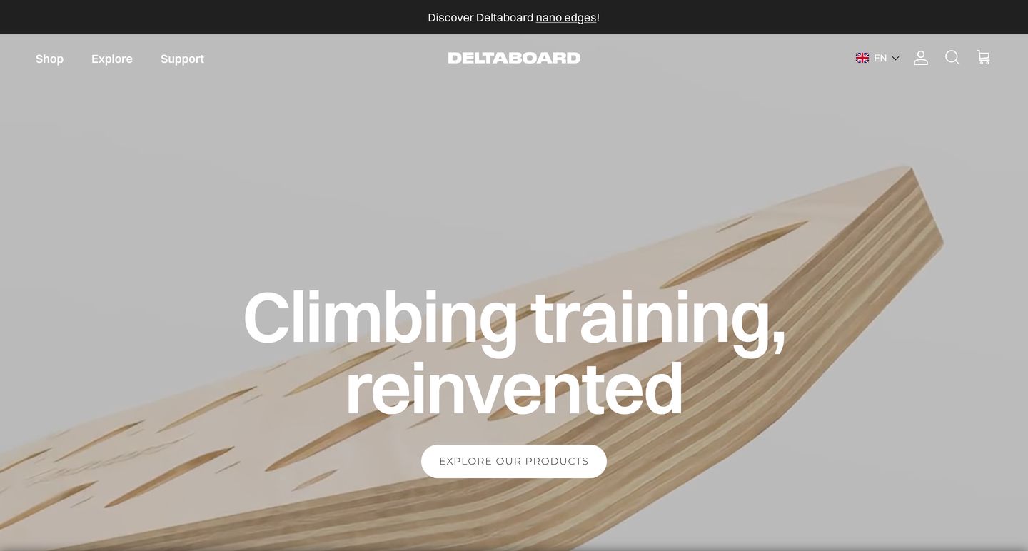
StrongA tactile, studio-lit wooden training board angles dramatically across a clean canvas beneath bold modern typography.
- Mood
- organic + serene
- Layout
- 1 col · centered · airy
- 01
showcase
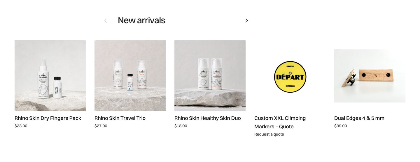
Clean, minimal e-commerce product carousel showcasing climbing care and training gear with stark studio photography on white.
- Mood
- serene + organic
- Layout
- 5 col · grid · airy
- 02
showcase
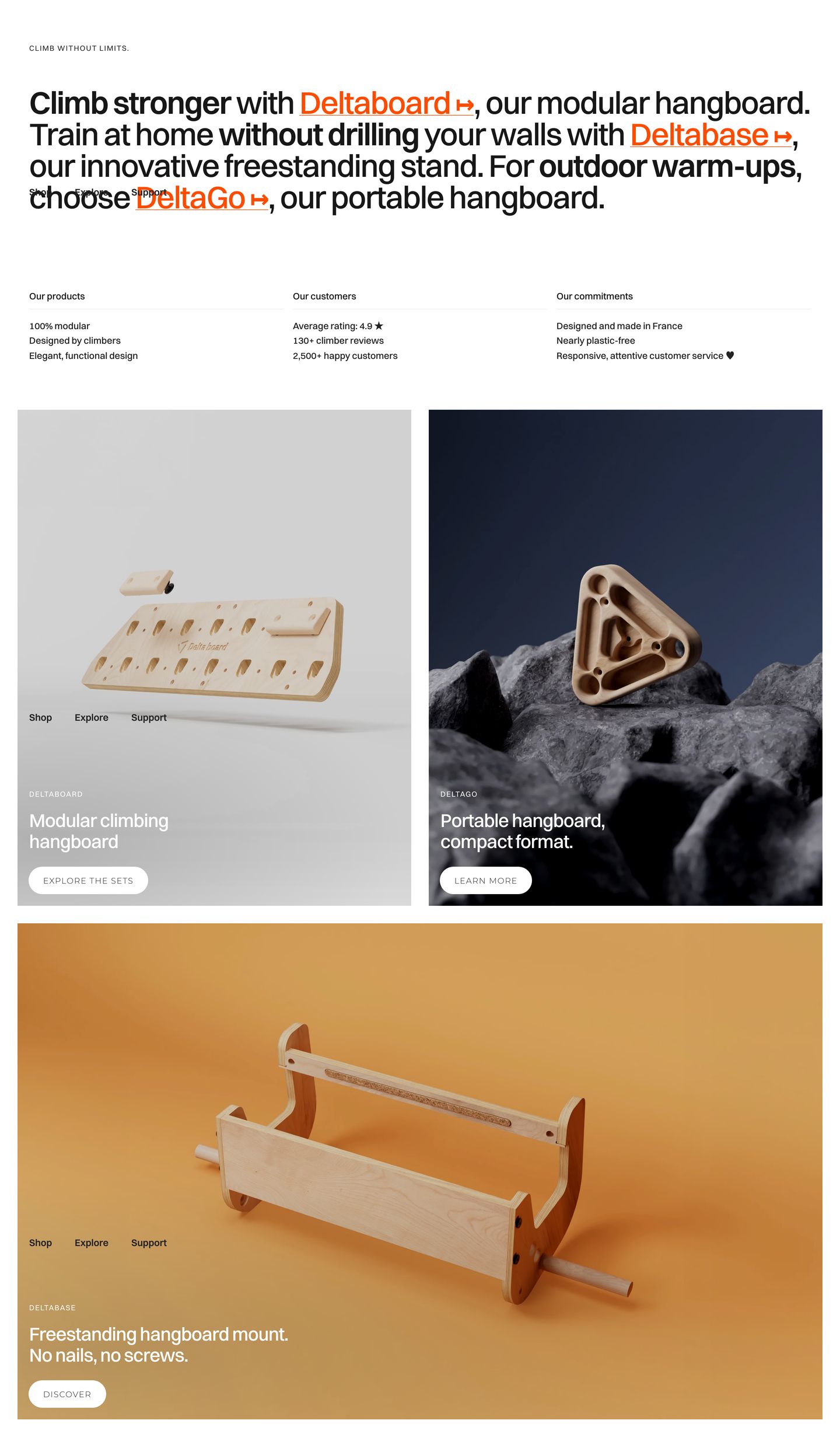
StrongTactile wooden climbing equipment showcased through clean editorial typography and warm, textured sculptural renders.
- Mood
- organic + serene
- Layout
- 2 col · grid · balanced
- 03
statement
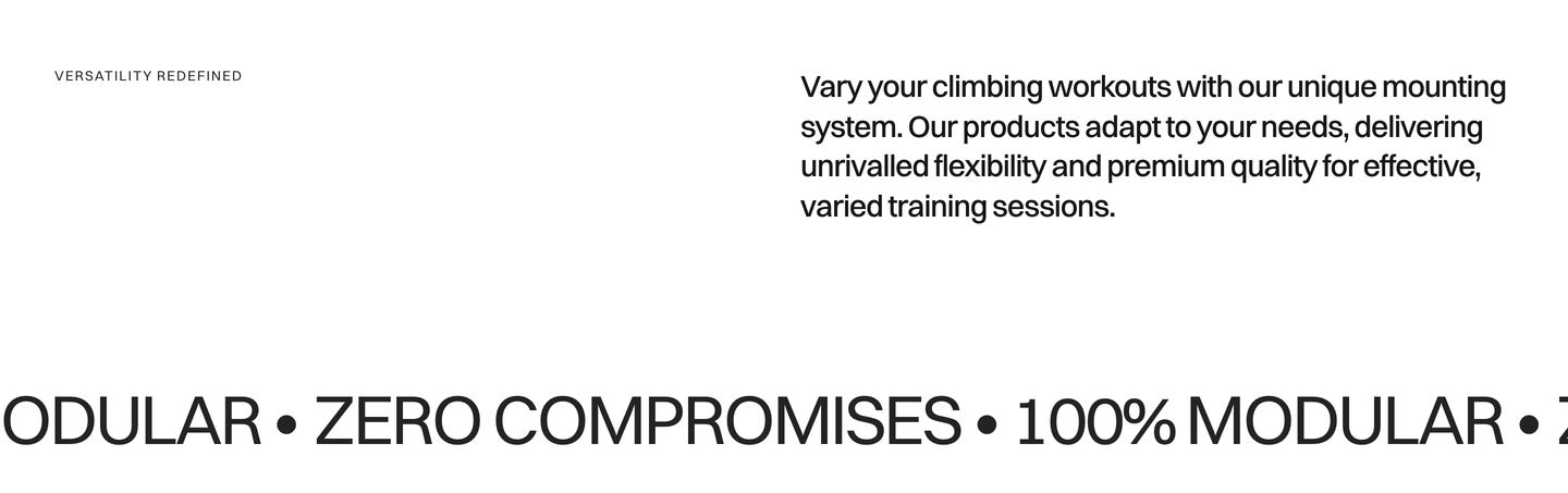
Stark, high-contrast Swiss typographic layout pairing an airy statement paragraph with an oversized running marquee divider.
- Mood
- clinical + serene
- Layout
- 2 col · split · airy
- 04
feature
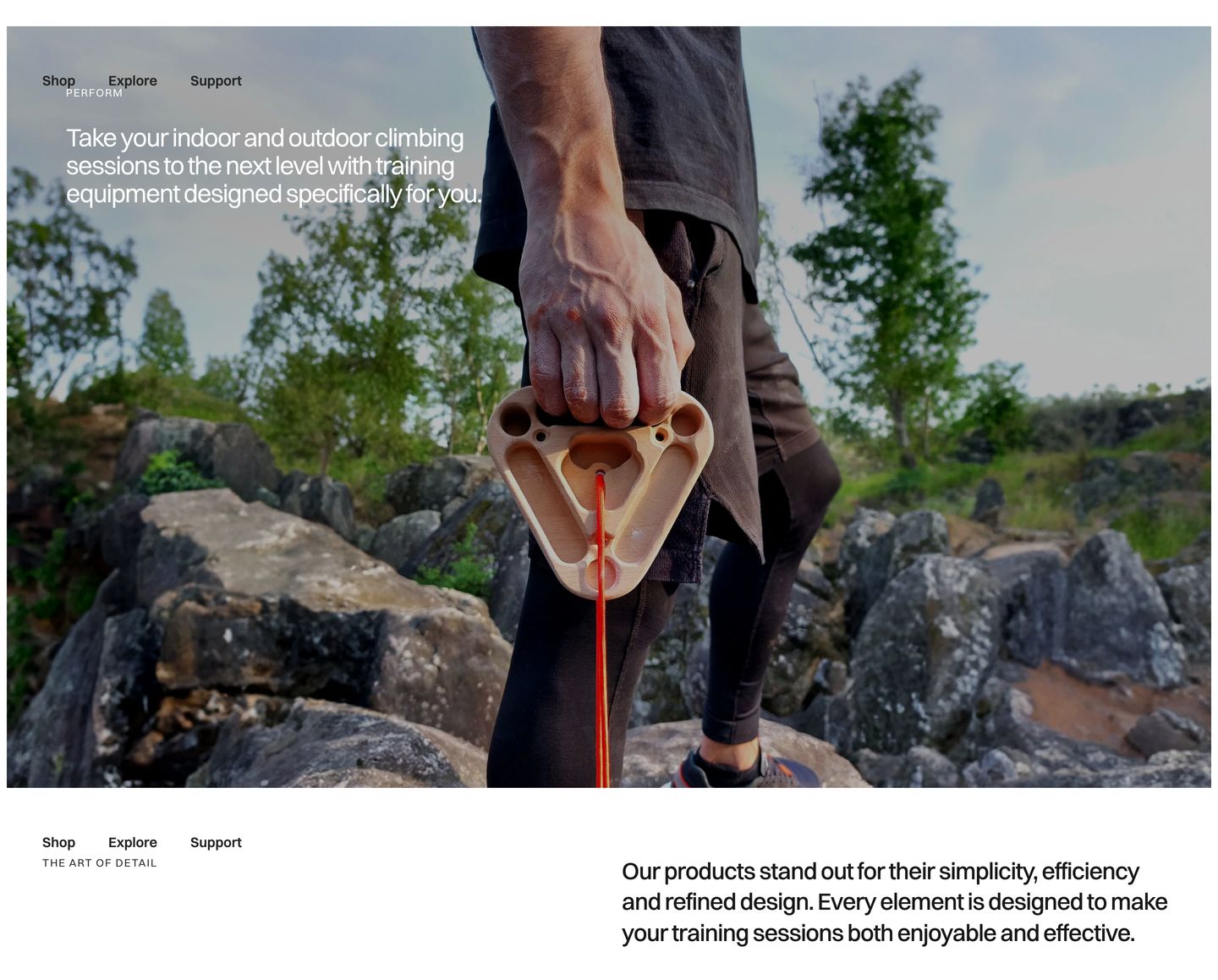
StrongTactile outdoor photography of climbing gear paired with restrained editorial typography delivers a rugged, grounded product story.
- Mood
- organic + serene
- Layout
- 2 col · stacked · airy
- 05
feature grid
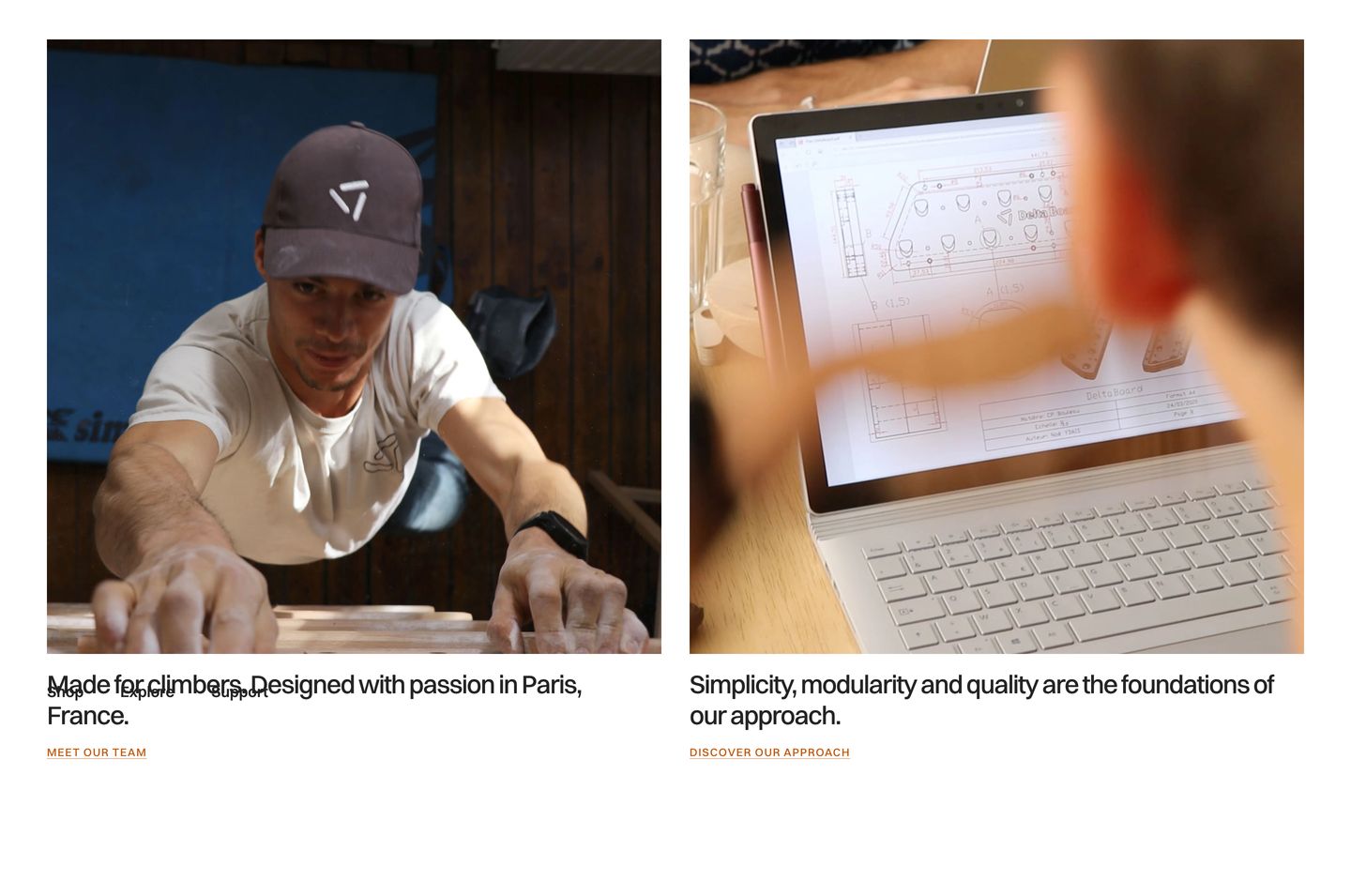
Documentary workshop photography and clean typography introduce the brand philosophy across a balanced two-column grid.
- Mood
- organic + serene
- Layout
- 2 col · grid · balanced
- 06
statement
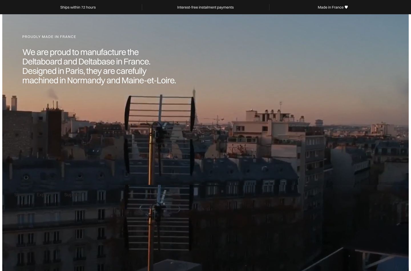
Quiet, atmospheric statement against a dusky Parisian rooftop skyline expressing pride in domestic French craftsmanship.
- Mood
- serene + organic
- Layout
- 1 col · full bleed · airy
- 07
footer
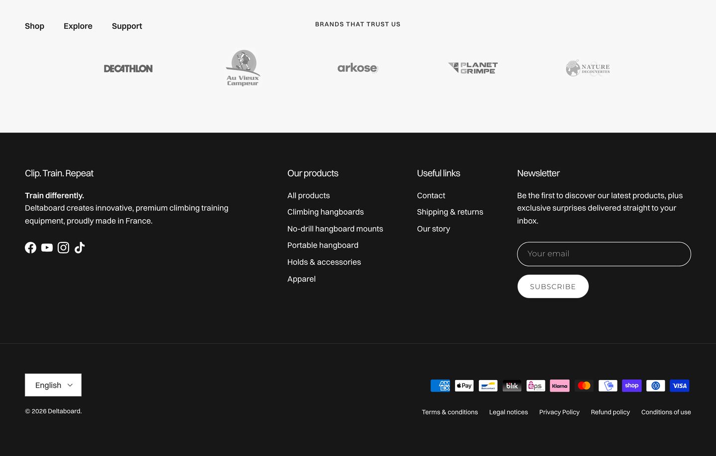
A stark, structured dark footer anchored by partner trust logos and clean multi-column navigation.
- Mood
- serene
- Layout
- 4 col · stacked · balanced