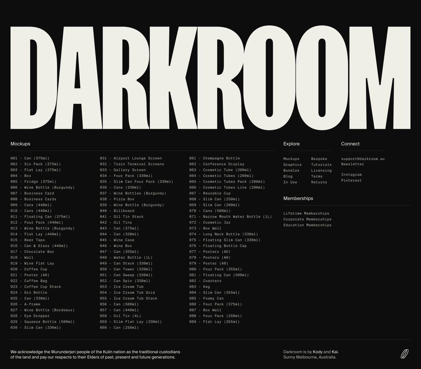
Darkroom
Technical precision meets dark-mode luxury. Deep charcoal surfaces, razor-sharp monospaced metadata, and massive condensed typography create a clinical digital foundry aesthetic. High-fidelity product renders stand out against the near-black background.
Take the vibe
Rated
6.8/ 10
From 6 analyzed sections. Two measured components and one judged by a model. Distinction is a rank within the library; the rest are scores in their own right.
- AI scorejudged
- 10.0
- Systemmeasured
- 4.8
- Distinctionmeasured
- 2.6
- on the grid
- 0%
- vertical rhythm
- 75%
- type on a scale
- 50%
- contrast passing AA
- 67%
- unlike the library
- 0.57
- model craft
- 8.3/10
- model deviation
- 5.2/10
Color
Background#0d0d0d
Text#efeee8
Accent#2426fa
Surface#131313
Muted#b3b2ac
Typefaces
- Display
- Suisseintl Webs
- Body
- Suisseintl Webs
- Mono
- Suisseintlmono Webs
- Source
- self_hosted
- Scale
- 12 · 14 · 16 · 18 · 24 · 28
Layout
- Grid
- —
- Container
- —
- Spacing base
- 4px
- Radius
- 0px
Capture
- Category
- ecommerce
- Sections
- 6
- Captured
- 2026-09-11
- Rhythm
- dark x8
Type rules
- body text runs in monospaced or neutral grotesque at 14px with tight line-height
- labels and navigation links rendered in crisp uppercase
- massive condensed display wordmarks frame the top and bottom of the page
Color rules
- deep black background (#0d0d0d) dominates the entire viewport
- electric blue (#2426fa) reserved exclusively for high-priority action buttons
- subtle hairline borders in dark grey (#282827) structure component cards
Voice rules
- every product title accompanied by its precise asset type descriptor
- index listings strictly numbered with three-digit zero padding
Holds it together
- use electric blue for primary interactive CTAs only
- format catalog indices with three-digit numbers and monospaced typography
- frame the page with massive brand logotypes at both top hero and footer boundaries
- maintain high-contrast product imagery inside structured neutral card containers
Contrast
text on background16.7:1 AAA
muted text on background9.1:1 AAA
text on surface16.0:1 AAA
muted text on surface8.7:1 AAA
accent on background2.5:1 fail
background on accent2.5:1 fail
Type, measured
- Body
- 14px / 1.3
- Measure
- 93 characters
- Display
- 40px / 1
- Tracking
- 0em display
- Scale ratio
- 1.30
Voice
- Tone
- minimal, technical, precise
- Sentences
- short
- Person
- second
- Vocabulary
- technical
- Calls to action
- shop, browse, view, submit
Built with
- Builder
- webflow
- Framework
- —
- Motion
- gsap
- WebGL
- —
- Nav
- —
- Length
- 6.4 screens
Sections in page order
- 00
hero
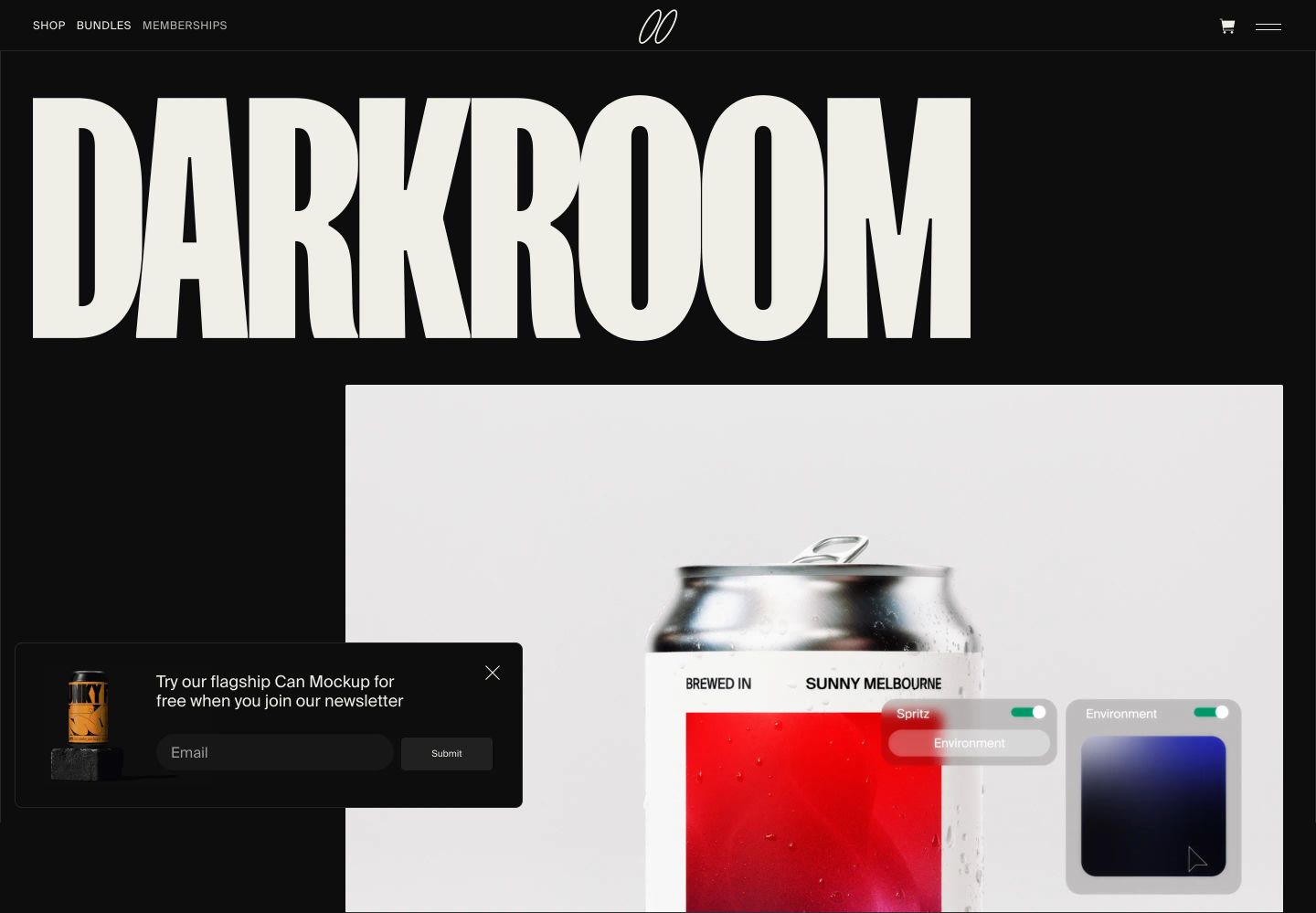
StrongMonolithic, high-impact dark hero dominated by an oversized condensed masthead intersecting a hyper-realistic 3D product mockup.
- Mood
- luxurious
- Layout
- 1 col · stacked · dense
- 01
hero
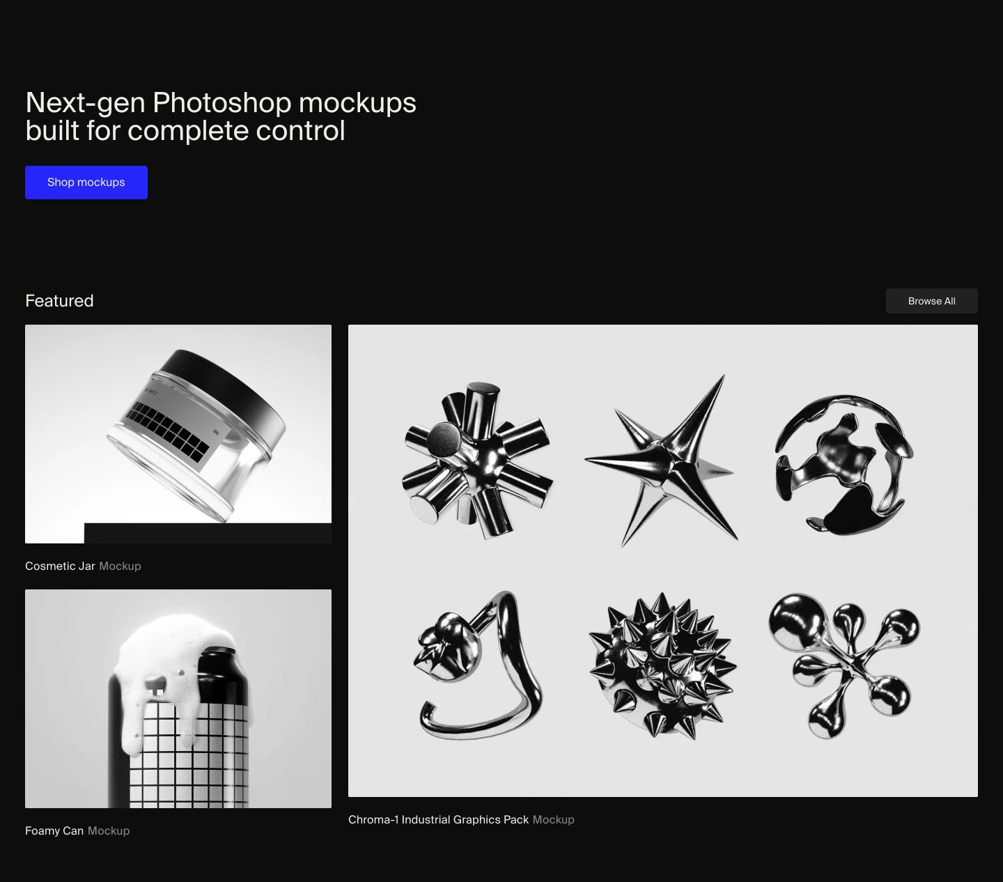
StrongSleek and restrained dark hero showcasing high-contrast chrome and tactile 3D product mockups with precise Swiss typography.
- Mood
- luxurious + clinical
- Layout
- 2 col · stacked · balanced
- 02
showcase
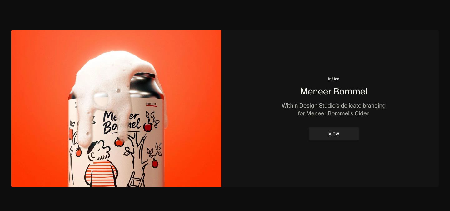
A split showcase balancing a vivid orange overflowing cider can against quiet, centered dark editorial typography.
- Mood
- playful + serene
- Layout
- 2 col · split · balanced
- 03
showcase
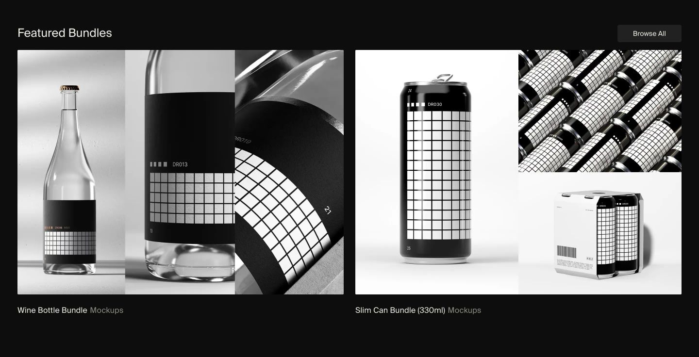
A stark, monochromatic product showcase presenting 3D mockup bundles with rigorous studio lighting against a deep dark background.
- Mood
- luxurious + clinical
- Layout
- 2 col · grid · balanced
- 04
logo bar
A quiet, dark grid of prominent brand logos framed between understated typography and a social impact pledge.
- Mood
- luxurious + serene
- Layout
- 5 col · centered · balanced

- 05
footer
StrongMonumental dark footer dominated by an oversized condensed headline and a dense, utilitarian monospace catalog directory.
- Mood
- organic
- Layout
- 5 col · grid · dense