Inspiration · · 7 min read
20 Website Design Moods and How to Design for Each
20 website design moods, from serene and luxurious to gritty and eerie, with the palette, typography and imagery that create each one on a real website.

There are 20 website design moods worth knowing, from calm ones like serene and contemplative to charged ones like energetic, urgent and rebellious. Each mood comes from a recognizable combination of palette, typography, imagery, density and motion, and each has signals that rule it out. Below is every mood we use to sort real websites, with what it feels like and how to design for it.
Key takeaways
- A mood is a combination, not a single choice. Warm colors alone do not make a site cozy; warm colors with tactile textures and domestic imagery do.
- What rules a mood out matters as much as what creates it. One countdown timer breaks serenity; one stock photo breaks whimsy.
- Neighboring moods are easy to confuse. Dreamy blurs where ethereal glows; mysterious invites you in where eerie warns you away.
- Pick one leading mood and at most one supporting one.
- Every mood links to real examples in the library, so you can see it working before designing it.
How to use this list
Read the mood that matches your brief, then read its neighbors to make sure you are not designing the one next to it. Use the palette, type and imagery notes as starting points for a moodboard; our guide on how to make a website moodboard shows how to turn them into decisions.
1. Nostalgic
A longing for a remembered or imagined past: warm, familiar, a little bittersweet. It references a real era sincerely rather than inventing one.
- Palette: faded, warm tones; yellowed whites, sepia, sun-bleached primaries.
- Type: faces from a specific era, such as old-style serifs, slab serifs or period display lettering.
- Imagery: grain, scratches, film borders and softened photography.
See nostalgic websites.
2. Dreamy
A soft, unreal, half-asleep world. Gentle and floating rather than sharp.
- Palette: pastel gradients, lilac, peach, powder blue, low contrast.
- Type: light weights, rounded or soft serifs, generous spacing.
- Imagery: blur, haze, slow floating motion; never hard edges or black grounds.
See dreamy websites.
3. Playful
An invitation to touch and poke. Toy-like and reactive.
- Palette: several cheerful, saturated colors used together.
- Type: chunky, rounded sans serifs at heavy weights.
- Imagery: rounded shapes, stickers, springy hover effects that bounce back.
See playful websites.
4. Serene
Quiet, unhurried peace: the page lets you exhale.
- Palette: a narrow, muted range with one or two accents at most.
- Type: light to regular weights, plenty of line height, modest sizes.
- Imagery: few elements per screen, lots of empty ground, calm nature or interiors. Warmer and more humane than clinical.
See serene websites.
5. Luxurious
Wealth and restraint. Everything feels expensive and unhurried.
- Palette: black, cream or deep tones with a single metallic or muted accent.
- Type: high-contrast Didone serifs or wide, spaced capitals.
- Imagery: very few objects shown clearly, oversized whitespace, no discount badges or dense grids.
See luxurious websites.
6. Energetic
Adrenaline. Your pulse rises as the page moves.
- Palette: saturated, high-contrast pairs.
- Type: heavy, condensed or italic sans serifs, often very large.
- Imagery: diagonals, action, fast or looping motion. Energetic excites without pushing one action, which is what separates it from urgent.
See energetic websites.
7. Mysterious
Something is hidden and you lean in to find out.
- Palette: dark grounds, low light, one restrained accent.
- Type: quiet, refined, often small; little is explained.
- Imagery: shadow, cropped details, content revealed progressively as you scroll. It intrigues rather than unsettles.
See mysterious websites.
8. Cozy
Indoors on a cold day: blankets, warm drinks, safety.
- Palette: warm neutrals, oatmeal, terracotta, honey; no cool blues.
- Type: soft serifs and friendly sans serifs at comfortable sizes.
- Imagery: tactile textures, domestic scenes, knitted or wooden surfaces. Present-tense comfort rather than memory.
See cozy websites.
9. Clinical
Precision and sterility, like a lab.
- Palette: white dominance, cool grays, a single functional accent.
- Type: neutral grotesques, hairline rules, strict alignment.
- Imagery: product renders or diagrams with no texture, ornament or hand-drawn elements.
See clinical websites.
10. Whimsical
Gently absurd: an imagination let loose, politely.
- Palette: storybook colors, often slightly off-key.
- Type: hand-lettered or characterful display faces.
- Imagery: hand-made illustration, small surprises that reward exploring. Stock photography breaks it immediately.
See whimsical websites.
11. Melancholic
Beautiful sadness: absence, memory, a quiet ache.
- Palette: desaturated, cool or muddy tones.
- Type: light serifs, small sizes, lots of space around them.
- Imagery: isolated figures or objects, emptiness that feels emotional rather than organized. Serene emptiness feels peaceful; this feels lonely.
See melancholic websites.
12. Rebellious
Rules broken on purpose, and with craft.
- Palette: clashing or anti-harmonious colors used consistently.
- Type: distorted, overlapping, colliding type that resists easy reading.
- Imagery: collage, distortion, deliberate misuse of the grid. Unlike gritty, it actively defies.
See rebellious websites.
13. Reassuring
You are in safe hands and you know what happens next.
- Palette: calm, trustworthy blues, greens or warm neutrals with good contrast.
- Type: clear, legible sans or friendly serifs at comfortable sizes.
- Imagery: real people, clear product shots, trust signals such as reviews and certifications, a conventional structure.
See reassuring websites.
14. Urgent
Act now; time is running out.
- Palette: red and alert accents on high contrast.
- Type: bold, heavy, often uppercase.
- Imagery: countdowns, scarcity badges, several calls to action. Without a time or scarcity cue, it is not urgent.
See urgent websites.
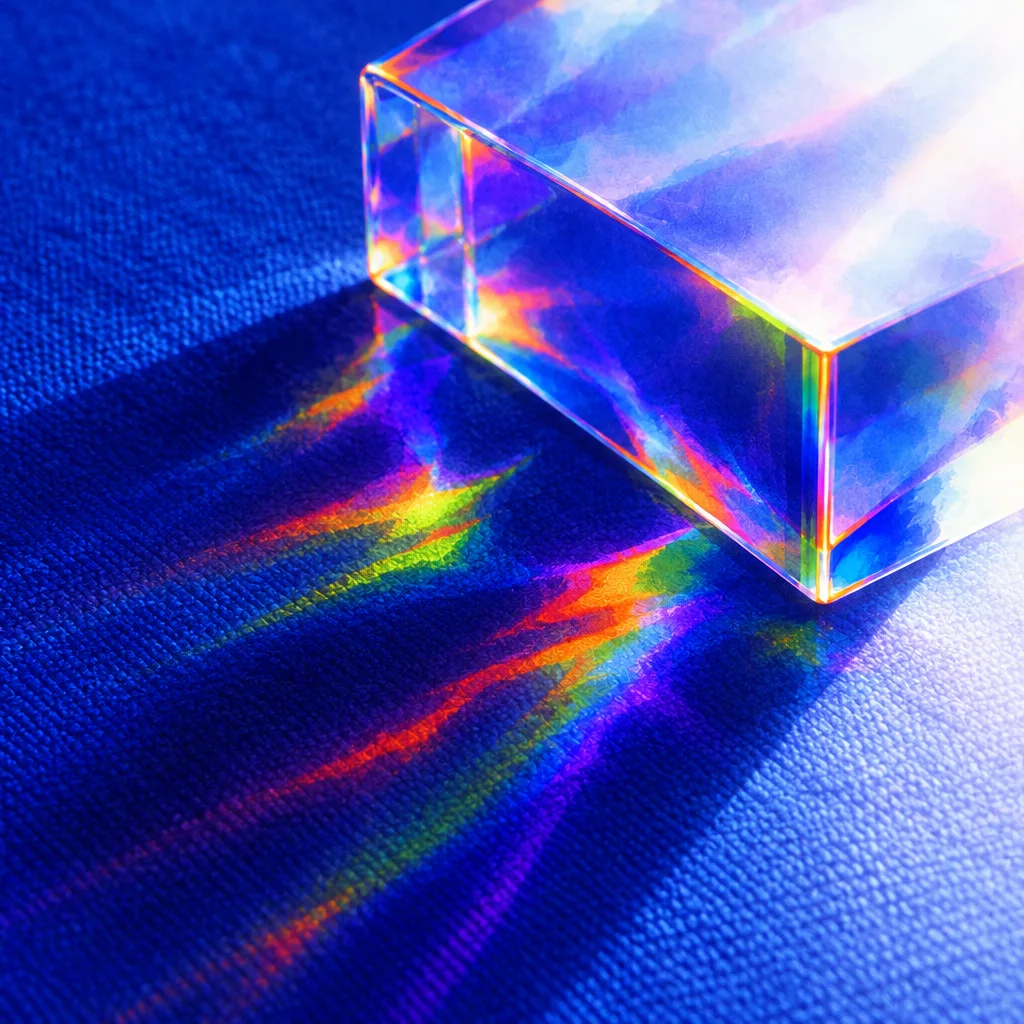
15. Ethereal
Otherworldly, weightless and luminous; almost sacred.
- Palette: pale, glowing, light-filled tones, iridescence.
- Type: thin weights, airy spacing.
- Imagery: light used as a material: glow, refraction, particles. Glow, not blur, is what separates it from dreamy.
See ethereal websites.
16. Gritty
Raw, unpolished and honest. Concrete and calloused hands.
- Palette: dirty neutrals, black, rust, concrete gray.
- Type: utilitarian grotesques, stencils, typewriter faces.
- Imagery: documentary photography, industrial texture, no decoration anywhere. Stoic rather than defiant.
See gritty websites.
17. Contemplative
The design slows you down and gives your thoughts room.
- Palette: quiet neutrals, paper tones, little color.
- Type: serious, readable serifs at long-form sizes, a comfortable measure.
- Imagery: sparse, chosen carefully, with pauses built into the reading structure. It engages thought where serene stills feeling.
18. Joyful
Uncomplicated happiness and celebration, without irony.
- Palette: warm, bright, harmonious colors.
- Type: open, friendly faces with cheerful weight.
- Imagery: people laughing, life, celebration, confetti-like details. It radiates even in a still screenshot, where playful needs to be touched.
See joyful websites.
19. Eerie
Something is wrong: the uncanny, a held breath.
- Palette: unnatural, sickly or slightly off colors.
- Type: subtly misaligned or distorted, quiet rather than loud.
- Imagery: distortion, emptiness, things almost but not quite right. It warns you away where mysterious draws you in.
See eerie websites.
20. Grounded
Earthy, organic, honest materials: bare feet on soil.
- Palette: earth tones, olive, clay, sand, bark.
- Type: sturdy, warm serifs or humanist sans serifs.
- Imagery: natural textures, plants, stone, imperfect organic shapes; no neon, chrome or glass effects. Outdoor earthiness, where cozy is indoor warmth.
See grounded websites.
Neighbors that are easy to confuse
| Pair | The deciding difference |
|---|---|
| Dreamy and ethereal | Blur against glow |
| Serene and clinical | Warm calm against cold order |
| Mysterious and eerie | Invites you in against warns you away |
| Energetic and urgent | Excitement against pressure toward one action |
| Cozy and grounded | Indoor warmth against outdoor earthiness |
| Playful and joyful | Wants to be touched against radiates feeling |
Combining moods
Most good sites have one leading mood and one supporting mood that shares at least one of its signals. A few combinations that work well:
- Clinical and reassuring: the order of a lab with the warmth of real people. Common for health and finance products.
- Cozy and nostalgic: warm neutrals plus an era's typography, ideal for food, crafts and small shops.
- Serene and luxurious: generous whitespace, very few objects, a restrained palette. Typical of hotels and skincare.
- Energetic and joyful: saturated, warm color with people in motion. Good for events and sport.
- Contemplative and melancholic: long-form reading with desaturated imagery, for essays, film and photography.
Some pairs cancel each other out. Serene and urgent cannot share a page: one countdown timer undoes all the calm. Whimsical and clinical pull in opposite directions, and luxurious rarely survives a playful, multi-color palette. When two moods conflict, pick the one that serves the visitor's main task and let the other go.
A practical test: take a screenshot of your hero, show it to someone for five seconds, and ask for one word. If the word they give you is a neighbor of your mood rather than the mood itself, adjust the deciding signal from the table above.
In short
Pick one leading mood, check its neighbors so you design the right one, and then make palette, type, imagery and motion agree. The fastest way to calibrate is to look at real examples: browse each mood in the library, then pull its palette into a plan with our color palette guide and its type with the Google Font pairings.
Questions, answered
What is the mood of a website?
The mood of a website is the feeling it creates before the visitor reads anything, produced by color, typography, imagery, spacing and motion working together. Calm, urgent, playful and luxurious are all moods.
How do I choose a mood for my website?
Start from how you want visitors to feel and what they need to do, then pick one main mood and at most one supporting mood. A booking site for a spa might be serene and reassuring; a ticket sale for a festival might be energetic and joyful.
Can a website have more than one mood?
Yes, but one should lead. Two compatible moods, such as cozy and nostalgic or clinical and reassuring, can strengthen each other, while two opposed moods, such as serene and urgent, usually cancel each other out.
What creates mood in web design?
Color temperature and saturation, the choice and weight of typefaces, the kind of imagery, the amount of whitespace and the speed of motion create most of a website's mood. Copy tone and layout density finish the job.
moodsweb designinspiration